 |
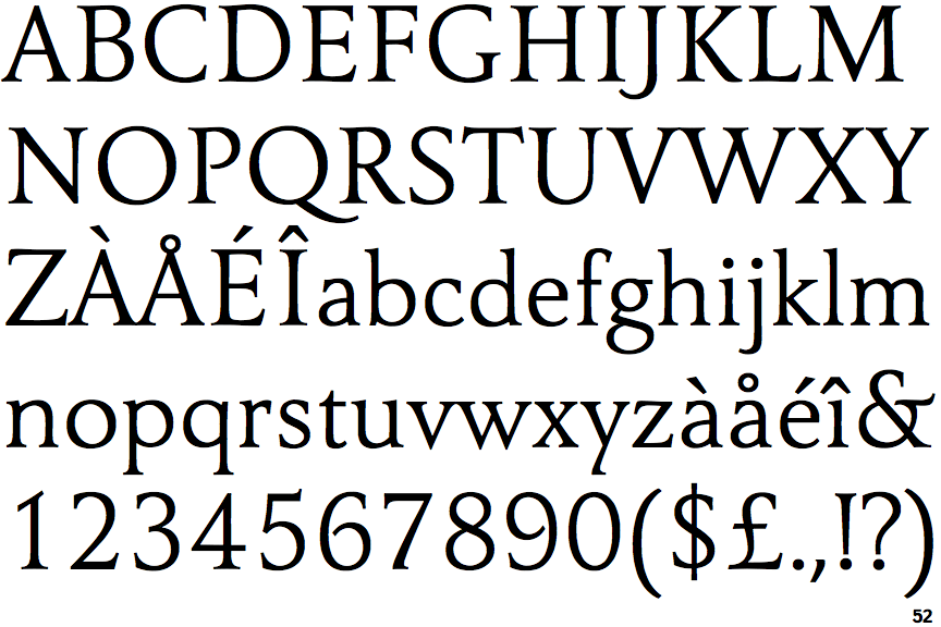
The '$' (dollar) has a single line crossing the 'S'.
|
 |
The '&' (ampersand) is traditional style with a gap at the top.
|
 |
The '4' is closed.
|
 |
The diagonal strokes of the upper-case 'K' meet at the vertical (with or without a gap).
|
 |
The centre bar of the upper-case 'P' leaves a gap with the vertical.
|
 |
The top of the upper-case 'W' has three upper terminals.
|
 |
The tail of the upper-case 'J' has a tapered end.
|
Note that the fonts in the icons shown above represent general examples, not necessarily the two fonts chosen for comparison.
Show Examples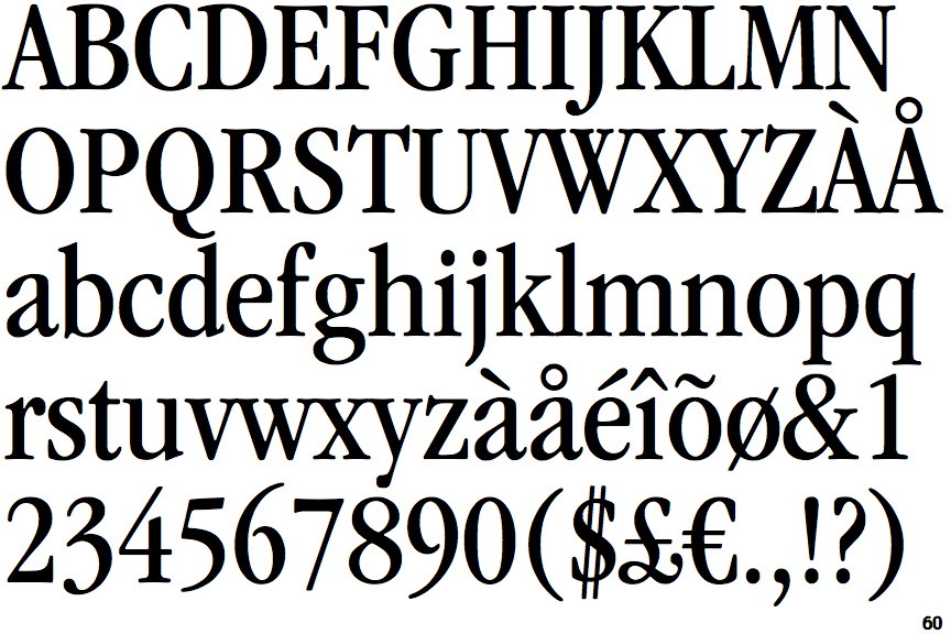
 |
The '$' (dollar) has a double line crossing the 'S'.
|
 |
The '&' (ampersand) is traditional style with two enclosed loops.
|
 |
The '4' is open.
|
 |
The diagonal strokes of the upper-case 'K' meet in a 'T'.
|
 |
The centre bar of the upper-case 'P' meets the vertical.
|
 |
The top of the upper-case 'W' has four upper terminals.
|
 |
The tail of the upper-case 'J' has a rounded end or ball.
|