 |
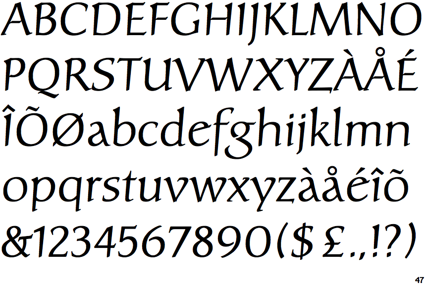
The upper-case 'U' has a stem/serif.
|
 |
The centre bar of the upper-case 'E' has no serifs.
|
 |
The upper-case 'G' foot has no spur or serif.
|
 |
The strokes are sloped right (italic, oblique, or cursive).
|
 |
The bar of the upper-case 'G' is single-sided, left-facing.
|
 |
The lower-case 'e' has a straight angled bar.
|
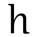 |
The feet of the lower-case 'h' have no serifs on the left and one on the right.
|
 |
The lower storey of the lower-case 'g' has a gap.
|
 |
The centre bar of the upper-case 'F' has no serifs.
|
 |
The stroke of the lower-case 'c' has a flat end or downward-pointing serif.
|
There are more than ten differences; only the first ten are shown.
Note that the fonts in the icons shown above represent general examples, not necessarily the two fonts chosen for comparison.
Show Examples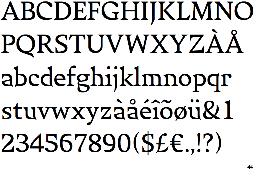
 |
The upper-case 'U' has no stem/serif.
|
 |
The centre bar of the upper-case 'E' has serifs.
|
 |
The upper-case 'G' foot has a forward pointing spur or serif.
|
 |
The strokes are upright.
|
 |
The bar of the upper-case 'G' is double-sided.
|
 |
The lower-case 'e' has a straight horizontal bar.
|
 |
The feet of the lower-case 'h' have two serifs on each foot.
|
 |
The lower storey of the lower-case 'g' has no gap.
|
 |
The centre bar of the upper-case 'F' has serifs.
|
 |
The stroke of the lower-case 'c' has a rounded end or ball.
|