 |
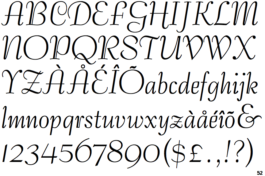
The upper-case 'Q' tail crosses the circle.
|
 |
The '&' (ampersand) looks like 'Et' with a gap at the top.
|
 |
The '4' is open.
|
 |
The diagonal strokes of the upper-case 'K' connect to the vertical via a horizontal bar.
|
 |
The centre bar of the upper-case 'P' meets the vertical.
|
 |
The upper-case 'Y' arms and tail are separate strokes.
|
 |
The top of the upper-case 'A' has no serifs or cusps.
|
 |
The upper-case 'A' has parallel verticals.
|
 |
The foot of the '4' has no serifs.
|
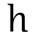 |
The feet of the lower-case 'h' have no serifs on the left and one on the right.
|
There are more than ten differences; only the first ten are shown.
Note that the fonts in the icons shown above represent general examples, not necessarily the two fonts chosen for comparison.
Show Examples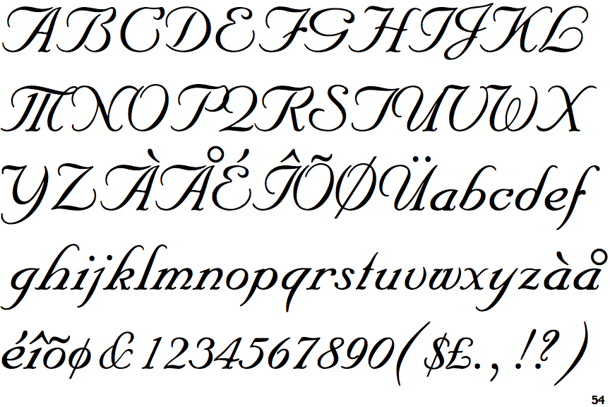
 |
The upper-case 'Q' tail forms part of the stroke of an open circle.
|
 |
The '&' (ampersand) is traditional style with a gap at the top.
|
 |
The '4' is closed.
|
 |
The diagonal strokes of the upper-case 'K' meet in a 'T'.
|
 |
The centre bar of the upper-case 'P' leaves a gap with the vertical.
|
 |
The upper-case 'Y' right-hand arm forms a continuous stroke with the tail.
|
 |
The top of the upper-case 'A' has a serif or cusp on the left.
|
 |
The upper-case 'A' has tapered verticals.
|
 |
The foot of the '4' has double-sided serifs.
|
 |
The feet of the lower-case 'h' have two serifs on each foot.
|