Identifont

Fonts by Appearance

Fonts by Name

Fonts by Similarity

Fonts by Picture

Fonts by Designer/Publisher

Differences

TweetTweet Differences

Compare: and  

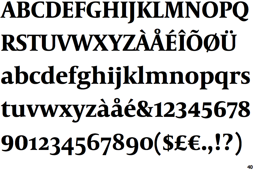
Capitolium News 2 Bold

Capitolium News 2 Bold

Single
The diagonal strokes of the upper-case 'K' meet at the vertical (with or without a gap).
None
The centre vertex of the upper-case 'W' has no serifs.
Pointed
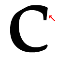
The stroke of the lower-case 'c' has a flat end or downward-pointing serif.
Closed
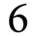
The bowl of the '6' meets the vertical.

Note that the fonts in the icons shown above represent general examples, not necessarily the two fonts chosen for comparison.

Show Examples
Dante Bold

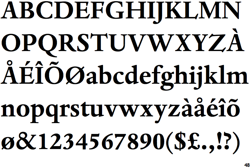
Dante Bold

Double
The diagonal strokes of the upper-case 'K' meet in a 'T'.
Both
The centre vertex of the upper-case 'W' has two separate serifs.
Ball
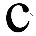
The stroke of the lower-case 'c' has a rounded end or ball.
Open
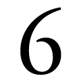
The bowl of the '6' leaves a gap with the vertical.