 |
The upper-case 'Q' tail forms part of the stroke of an open circle.
|
 |
The upper-case 'J' sits on the baseline.
|
 |
The '4' is closed.
|
 |
The top of the upper-case 'A' has a serif or cusp on the left.
|
 |
The tail of the upper-case 'T' curves to the left.
|
 |
The tail of the lower-case 'f' descends below the baseline.
|
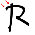 |
The upper-case 'R' vertical stroke crosses the bowl.
|
Note that the fonts in the icons shown above represent general examples, not necessarily the two fonts chosen for comparison.
Show Examples
 |
The upper-case 'Q' tail touches the circle.
|
 |
The upper-case 'J' descends below the baseline.
|
 |
The '4' is open.
|
 |
The top of the upper-case 'A' has no serifs or cusps.
|
 |
The tail of the upper-case 'T' curves to the right.
|
 |
The tail of the lower-case 'f' sits on the baseline.
|
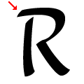 |
The upper-case 'R' bowl extends over the vertical stroke.
|