Identifont

Fonts by Appearance

Fonts by Name

Fonts by Similarity

Fonts by Picture

Fonts by Designer/Publisher

Differences

TweetTweet Differences

Compare: and  

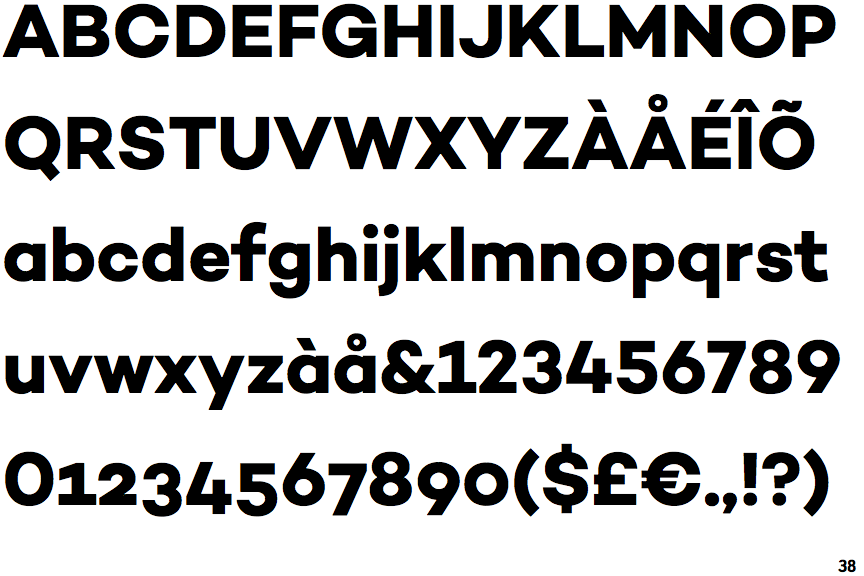
Campton Bold

Campton Bold

Open
The '&' (ampersand) is traditional style with a gap at the top.
Open
The '4' is open.
Spur
The upper-case 'G' has a spur/tail.
Straight
The tail of the upper-case 'Q' is straight (horizontal, diagonal, or vertical).
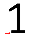
Base
The '1' (digit one) has double-sided base or serifs.

Note that the fonts in the icons shown above represent general examples, not necessarily the two fonts chosen for comparison.

Show Examples
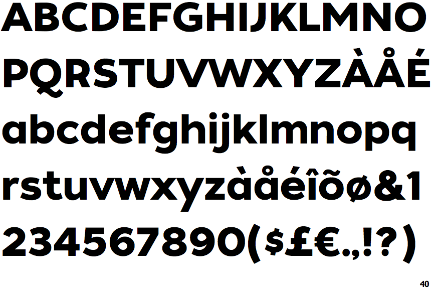
Tide Sans 600

Tide Sans 600

Closed
The '&' (ampersand) is traditional style with two enclosed loops.
Closed
The '4' is closed.
No spur
The upper-case 'G' has no spur/tail.
Curved
The tail of the upper-case 'Q' is curved, S-shaped, or Z-shaped.
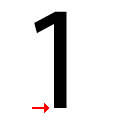
No base
The '1' (digit one) has no base.