Identifont

Fonts by Appearance

Fonts by Name

Fonts by Similarity

Fonts by Picture

Fonts by Designer/Publisher

Differences

TweetTweet Differences

Compare: and  

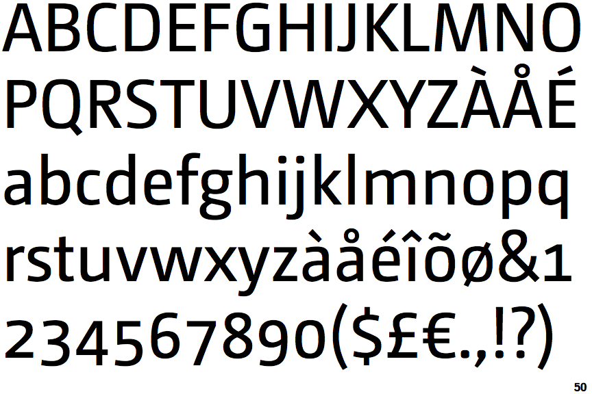
Camingo Dos

Camingo Dos

Touches
The upper-case 'Q' tail touches the circle.
Closed
The '&' (ampersand) is traditional style with two enclosed loops.
2-Storey
The lower-case 'g' is double-storey (with or without gap).
Left
The upper-case 'G' has a bar to the left.
Circle
The dot on the lower-case 'i' or 'j' is circular or oval.
Base
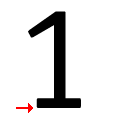
The '1' (digit one) has double-sided base or serifs.

Note that the fonts in the icons shown above represent general examples, not necessarily the two fonts chosen for comparison.

Show Examples
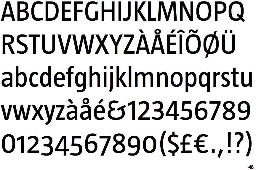
Taz

Taz

Crosses
The upper-case 'Q' tail crosses the circle.
Gap top
The '&' (ampersand) looks like 'Et' with a gap at the top.
1-Storey
The lower-case 'g' is single-storey (with or without loop).
No bar
The upper-case 'G' has no bar.
Square/rectangle
The dot on the lower-case 'i' or 'j' is square or rectangular.
No base
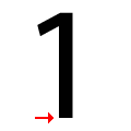
The '1' (digit one) has no base.