Identifont

Fonts by Appearance

Fonts by Name

Fonts by Similarity

Fonts by Picture

Fonts by Designer/Publisher

Differences

TweetTweet Differences

Compare: and  

Camber

Camber

Touches
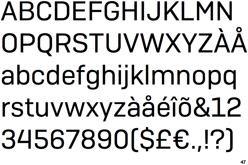
The upper-case 'Q' tail touches the circle.
Closed
The '&' (ampersand) is traditional style with two enclosed loops.
Round
The top storey of the '3' is a smooth curve.
Plain
The 'l' (lower-case 'L') has no serifs or tail.
Plain
The upper-case 'J' has no bar.

Note that the fonts in the icons shown above represent general examples, not necessarily the two fonts chosen for comparison.

Show Examples
T-Star

T-Star

Crosses
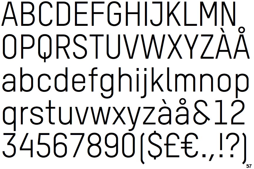
The upper-case 'Q' tail crosses the circle.
Open
The '&' (ampersand) is traditional style with a gap at the top.
Angled
The top storey of the '3' is a sharp angle.
Right
The 'l' (lower-case 'L') has a right-facing lower serif or tail.
Single-bar
The upper-case 'J' has a bar to the left.