 |
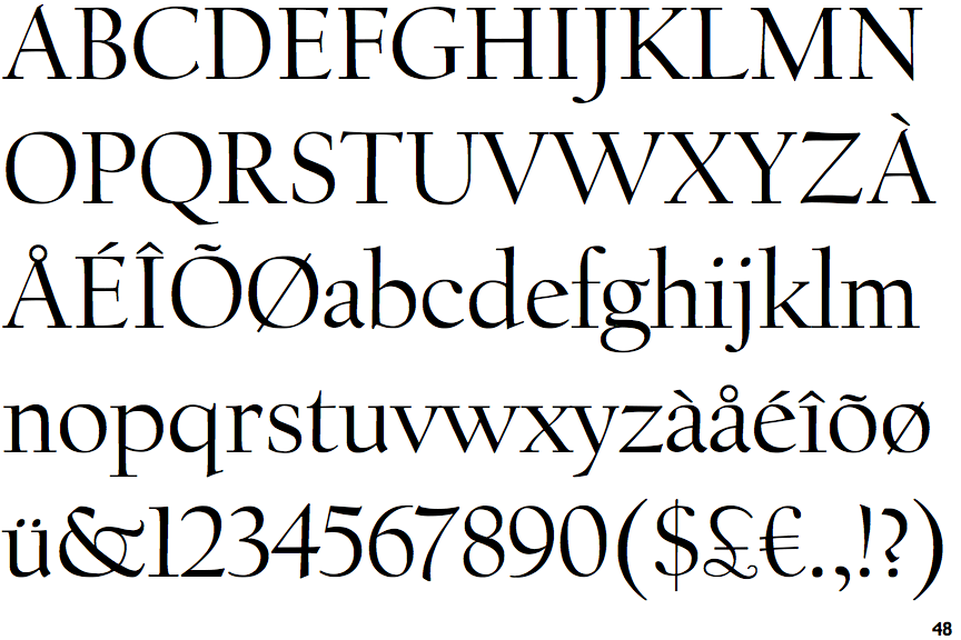
The '$' (dollar) has a single line crossing the 'S'.
|
 |
The '&' (ampersand) is traditional style with a gap at the top.
|
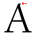 |
The top of the upper-case 'A' has a serif or cusp on the right.
|
 |
The top stroke of the upper-case 'C' has no upward-pointing serif.
|
 |
The foot of the '4' has no serifs.
|
 |
The lower-case 'e' has a straight angled bar.
|
 |
The lower storey of the lower-case 'g' has no gap.
|
 |
The leg of the upper-case 'K' has a single right-pointing serif or foot.
|
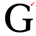 |
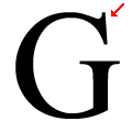
The top stroke of the upper-case 'G' has no upward-pointing serif.
|
Note that the fonts in the icons shown above represent general examples, not necessarily the two fonts chosen for comparison.
Show Examples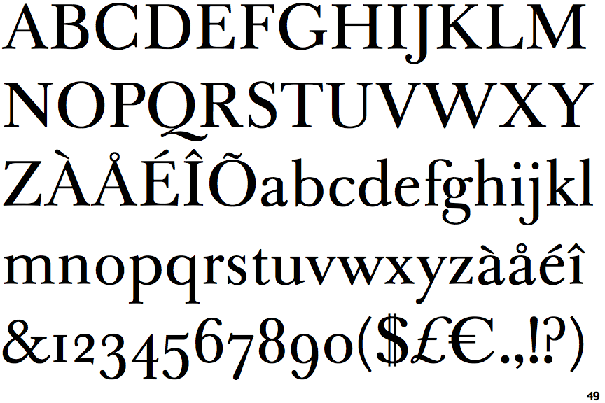
 |
The '$' (dollar) has a double line crossing the 'S'.
|
 |
The '&' (ampersand) is traditional style with two enclosed loops.
|
 |
The top of the upper-case 'A' has no serifs or cusps.
|
 |
The top stroke of the upper-case 'C' has a vertical or angled upward-pointing serif.
|
 |
The foot of the '4' has double-sided serifs.
|
 |
The lower-case 'e' has a straight horizontal bar.
|
 |
The lower storey of the lower-case 'g' has a gap.
|
 |
The leg of the upper-case 'K' has two serifs.
|
 |
The top stroke of the upper-case 'G' has a vertical or angled upward-pointing serif.
|