 |
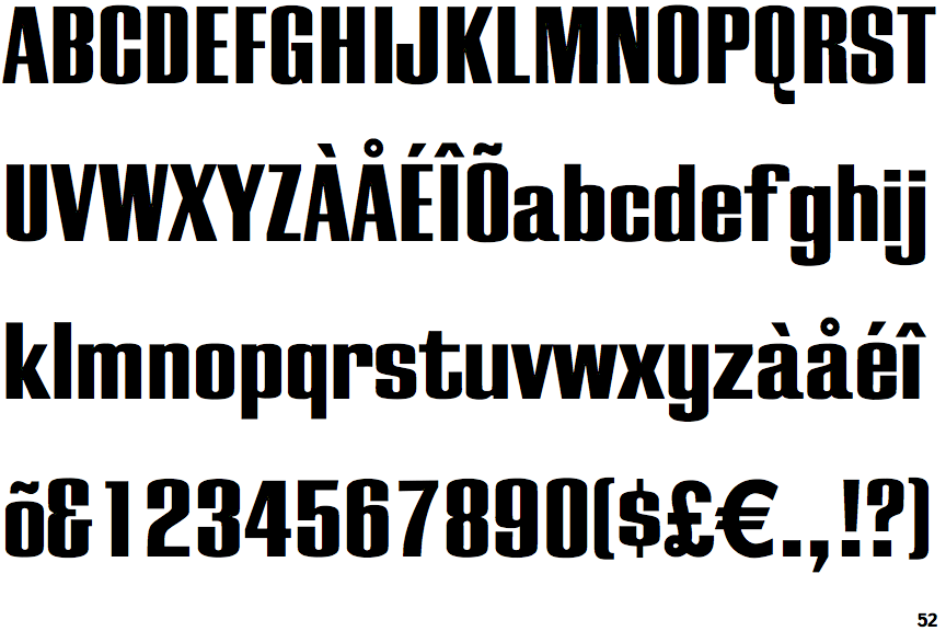
The '&' (ampersand) looks like 'Et' with a gap at the top.
|
 |
The sides of the lower-case 'y' are parallel (U-shaped).
|
 |
The stem of the '7' is curved inwards.
|
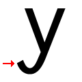 |
The tail of the lower-case 'y' is U-shaped.
|
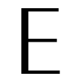 |
The upper-case 'E' horizontal strokes are visibly thinner than the vertical.
|
 |
The foot of the '£' (pound) has a loop.
|
Note that the fonts in the icons shown above represent general examples, not necessarily the two fonts chosen for comparison.
Show Examples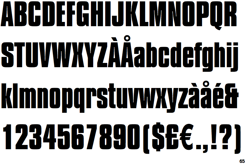
 |
The '&' (ampersand) looks like 'Et' with one enclosed loop (with or without exit stroke).
|
 |
The sides of the lower-case 'y' are angled (V-shaped).
|
 |
The stem of the '7' is straight.
|
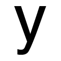 |
The tail of the lower-case 'y' is curved to the left or slightly upwards.
|
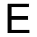 |
The upper-case 'E' strokes are all the same thickness.
|
 |
The foot of the '£' (pound) has no loop.
|