 |
The '$' (dollar) has a single line which does not cross the 'S'.
|
 |
The upper-case 'J' sits on the baseline.
|
 |
The diagonal strokes of the upper-case 'K' meet at the vertical (with or without a gap).
|
 |
The lower-case 'g' is double-storey (with or without gap).
|
 |
The leg of the upper-case 'R' is curved outwards.
|
 |
The upper-case letter 'I' is plain.
|
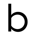 |
The bowl of the lower-case 'b' is a flattened circle or ellipse.
|
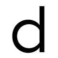 |
The bowl of the lower-case 'd' is a flattened circle or ellipse.
|
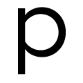 |
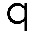
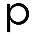
The bowl of the lower-case 'p' is a flattened circle or ellipse.
|
 |
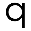
The bowl of the lower-case 'q' is a flattened circle or ellipse.
|
Note that the fonts in the icons shown above represent general examples, not necessarily the two fonts chosen for comparison.
Show Examples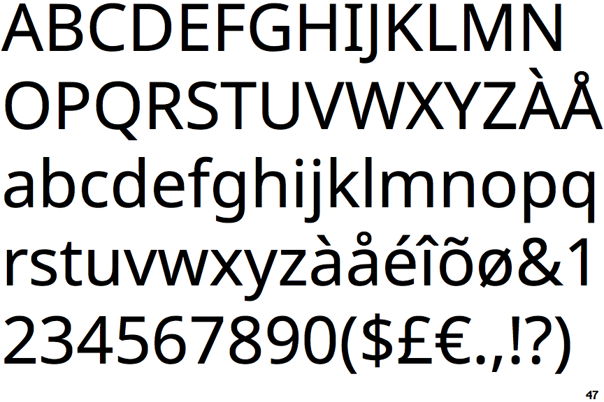
 |
The '$' (dollar) has a single line crossing the 'S'.
|
 |
The upper-case 'J' descends below the baseline.
|
 |
The diagonal strokes of the upper-case 'K' meet in a 'T'.
|
 |
The lower-case 'g' is single-storey (with or without loop).
|
 |
The leg of the upper-case 'R' is straight.
|
 |
The upper-case letter 'I' has serifs/bars.
|
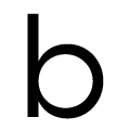 |
The bowl of the lower-case 'b' is a circle or ellipse.
|
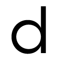 |
The bowl of the lower-case 'd' is a circle or ellipse.
|
 |
The bowl of the lower-case 'p' is a circle or ellipse.
|
 |
The bowl of the lower-case 'q' is a circle or ellipse.
|