Identifont

Fonts by Appearance

Fonts by Name

Fonts by Similarity

Fonts by Picture

Fonts by Designer/Publisher

Differences

TweetTweet Differences

Compare: and  

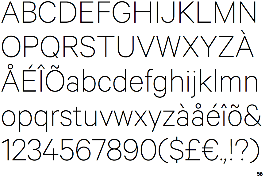
Calibre Thin

Calibre Thin

Open single
The '$' (dollar) has a single line which does not cross the 'S'.
Open
The '&' (ampersand) is traditional style with a gap at the top.
Baseline
The centre vertex of the upper-case 'M' is on the baseline.
Plain
The 'l' (lower-case 'L') has no serifs or tail.

Note that the fonts in the icons shown above represent general examples, not necessarily the two fonts chosen for comparison.

Show Examples
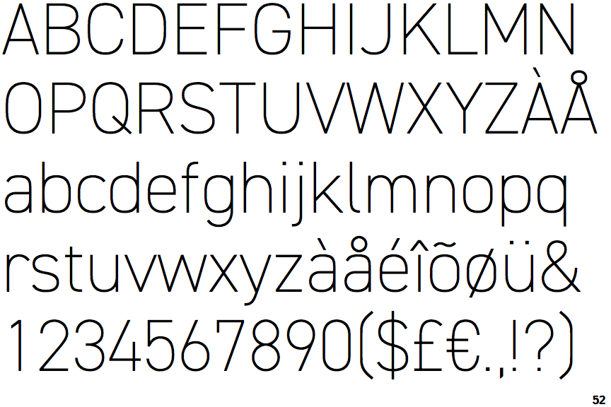
DIN 2014 Extra Light

DIN 2014 Extra Light

Single
The '$' (dollar) has a single line crossing the 'S'.
Closed
The '&' (ampersand) is traditional style with two enclosed loops.
Above
The centre vertex of the upper-case 'M' is above the baseline.
Right
The 'l' (lower-case 'L') has a right-facing lower serif or tail.