 |
The '&' (ampersand) looks like 'Et' with a gap at the top.
|
 |
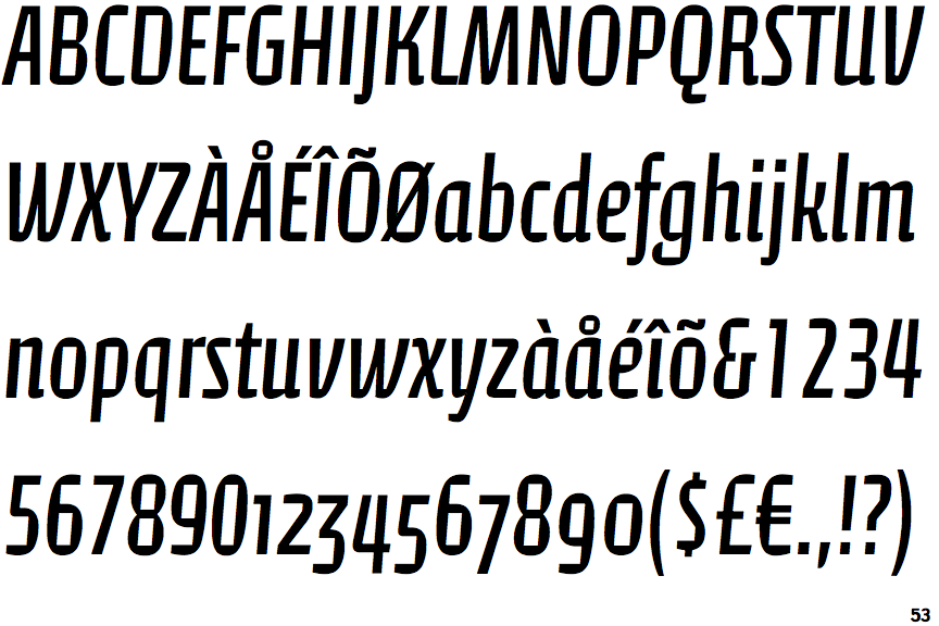
The '4' is open.
|
 |
The dot on the '?' (question-mark) is square or rectangular.
|
 |
The upper-case 'U' has a stem/serif.
|
 |
The upper-case 'J' has no bar.
|
 |
The dot on the lower-case 'i' or 'j' is square or rectangular.
|
 |
The lower-case 'i' has a right-facing lower serif or tail.
|
Note that the fonts in the icons shown above represent general examples, not necessarily the two fonts chosen for comparison.
Show Examples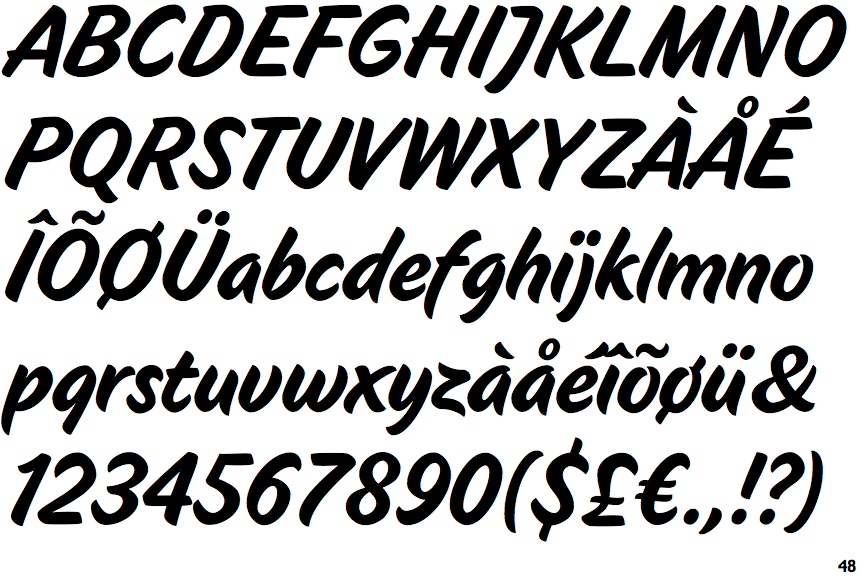
 |
The '&' (ampersand) is traditional style with two enclosed loops.
|
 |
The '4' is closed.
|
 |
The dot on the '?' (question-mark) is circular or oval.
|
 |
The upper-case 'U' has no stem/serif.
|
 |
The upper-case 'J' has a bar to the left.
|
 |
The dot on the lower-case 'i' or 'j' is circular or oval.
|
 |
The lower-case 'i' has no serifs or tail.
|