Identifont

Fonts by Appearance

Fonts by Name

Fonts by Similarity

Fonts by Picture

Fonts by Designer/Publisher

Differences

TweetTweet Differences

Compare: and  

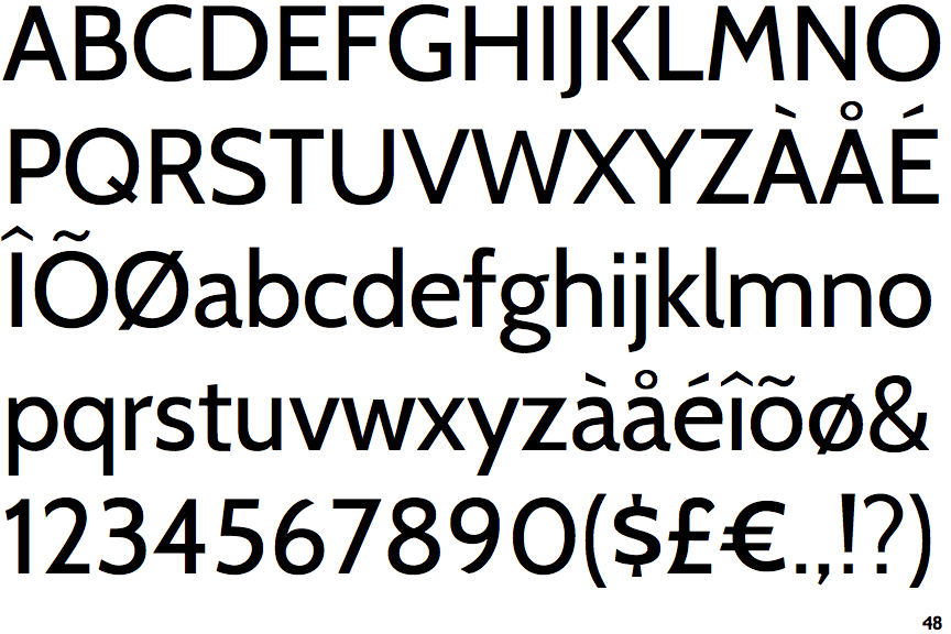
Cabin

Cabin

Crosses
The upper-case 'Q' tail crosses the circle.
Below
The upper-case 'J' descends below the baseline.
Sloping
The verticals of the upper-case 'M' are sloping.
Round
The top storey of the '3' is a smooth curve.
Left
The upper-case 'G' has a bar to the left.
Straight
The tail of the lower-case 'y' is substantially straight.

Note that the fonts in the icons shown above represent general examples, not necessarily the two fonts chosen for comparison.

Show Examples
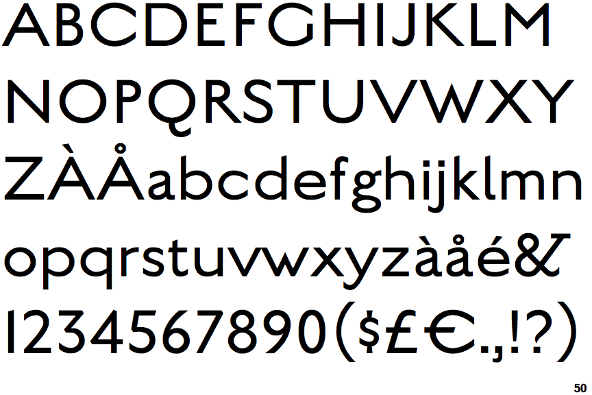
English Grotesque Thin

English Grotesque Thin

Touches
The upper-case 'Q' tail touches the circle.
On
The upper-case 'J' sits on the baseline.
Parallel
The verticals of the upper-case 'M' are parallel.
Angled
The top storey of the '3' is a sharp angle.
No bar
The upper-case 'G' has no bar.
Left
The tail of the lower-case 'y' is curved or U-shaped to the left.