 |
The '&' (ampersand) is traditional style with two enclosed loops.
|
 |
The diagonal strokes of the upper-case 'K' meet in a 'T'.
|
 |
The upper-case 'G' has a spur/tail.
|
 |
The stem of the '7' is curved inwards.
|
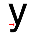 |
There is a smooth join at the junction of the lower-case 'y'.
|
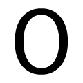 |
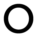
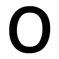
The verticals of the upper-case letter 'O' are fully curved.
|
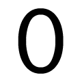 |
The verticals of the digit '0' are fully curved.
|
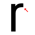 |
The arm of the lower-case 'r' points upwards or slightly downwards.
|
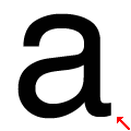 |
The stem of the lower-case 'a' is curved.
|
 |
The lower-case letter 'o' is circular or equal proportions.
|
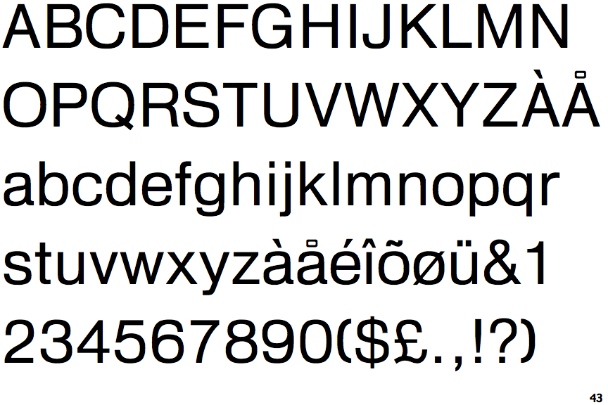
Note that the fonts in the icons shown above represent general examples, not necessarily the two fonts chosen for comparison.
Show Examples
 |
The '&' (ampersand) is traditional style with a gap at the top.
|
 |
The diagonal strokes of the upper-case 'K' connect to the vertical via a horizontal bar.
|
 |
The upper-case 'G' has no spur/tail.
|
 |
The stem of the '7' is straight.
|
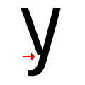 |
There is a break at the junction of the lower-case 'y'.
|
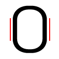 |
The verticals of the upper-case letter 'O' have straight segments.
|
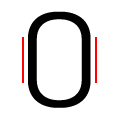 |
The verticals of the digit '0' have straight segments.
|
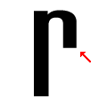 |
The arm of the lower-case 'r' points downwards.
|
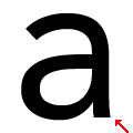 |
The stem of the lower-case 'a' is straight.
|
 |
The lower-case letter 'o' is taller than it is wide.
|