 |
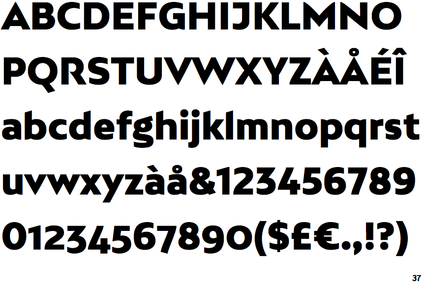
The upper-case 'Q' tail touches the circle.
|
 |
The diagonal strokes of the upper-case 'K' meet at the vertical (with or without a gap).
|
 |
The lower-case 'g' is double-storey (with or without gap).
|
 |
The 'l' (lower-case 'L') has no serifs or tail.
|
 |
The upper-case 'J' has a bar to the left.
|
 |
The centre bar of the upper-case 'R' leaves a gap with the vertical.
|
 |
The tail of the lower-case 'y' is substantially straight.
|
 |
The lower-case 'u' has a stem/serif.
|
 |
The bar of the '4' crosses the vertical.
|
Note that the fonts in the icons shown above represent general examples, not necessarily the two fonts chosen for comparison.
Show Examples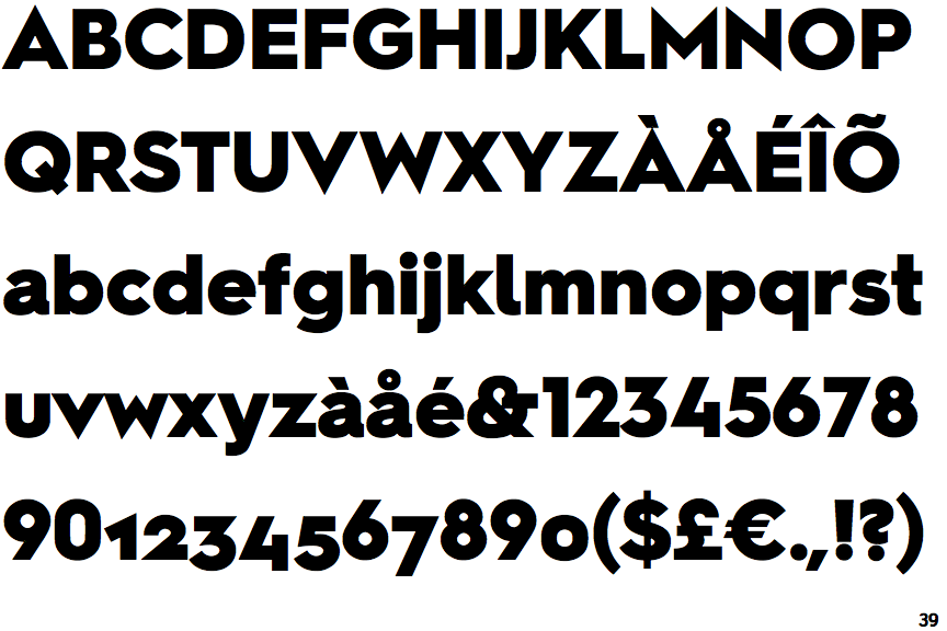
 |
The upper-case 'Q' tail crosses the circle.
|
 |
The diagonal strokes of the upper-case 'K' meet in a 'T'.
|
 |
The lower-case 'g' is single-storey (with or without loop).
|
 |
The 'l' (lower-case 'L') has a right-facing lower serif or tail.
|
 |
The upper-case 'J' has no bar.
|
 |
The centre bar of the upper-case 'R' meets the vertical.
|
 |
The tail of the lower-case 'y' is curved or U-shaped to the left.
|
 |
The lower-case 'u' has no stem/serif.
|
 |
The bar of the '4' does not cross the vertical.
|