 |
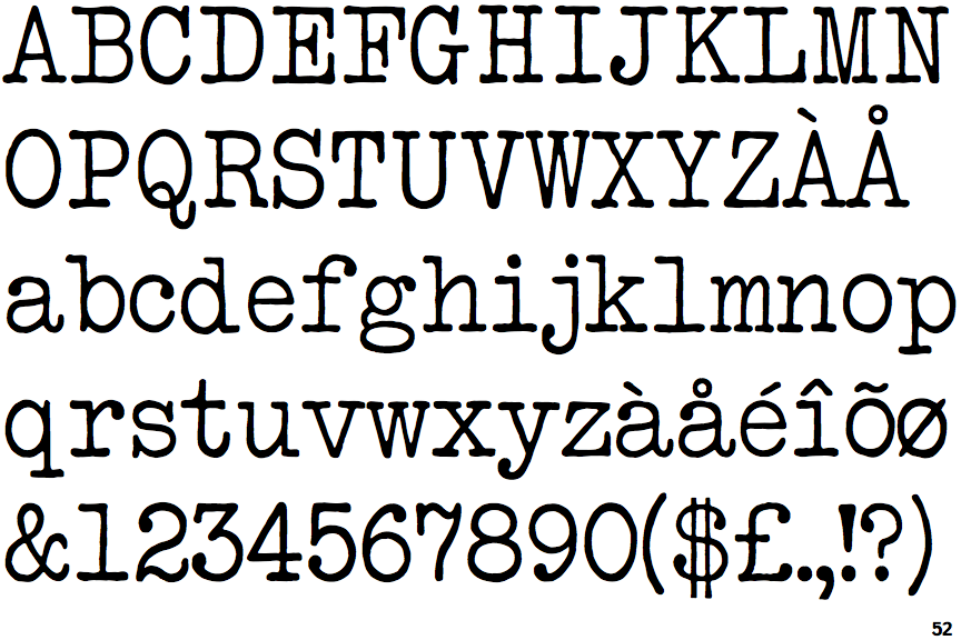
The centre vertex of the upper-case 'M' is on the baseline.
|
 |
The foot of the '4' has double-sided serifs.
|
 |
The character outlines are sharp.
|
 |
The foot of the '£' (pound) has no loop.
|
Note that the fonts in the icons shown above represent general examples, not necessarily the two fonts chosen for comparison.
Show Examples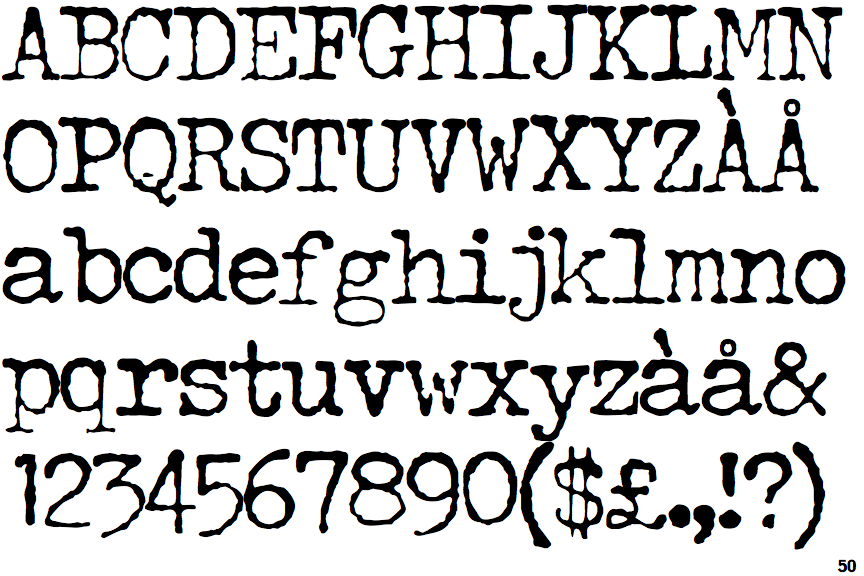
 |
The centre vertex of the upper-case 'M' is above the baseline.
|
 |
The foot of the '4' has no serifs.
|
 |
The character outlines are blurred, or out of focus.
|
 |
The foot of the '£' (pound) has a loop.
|