 |
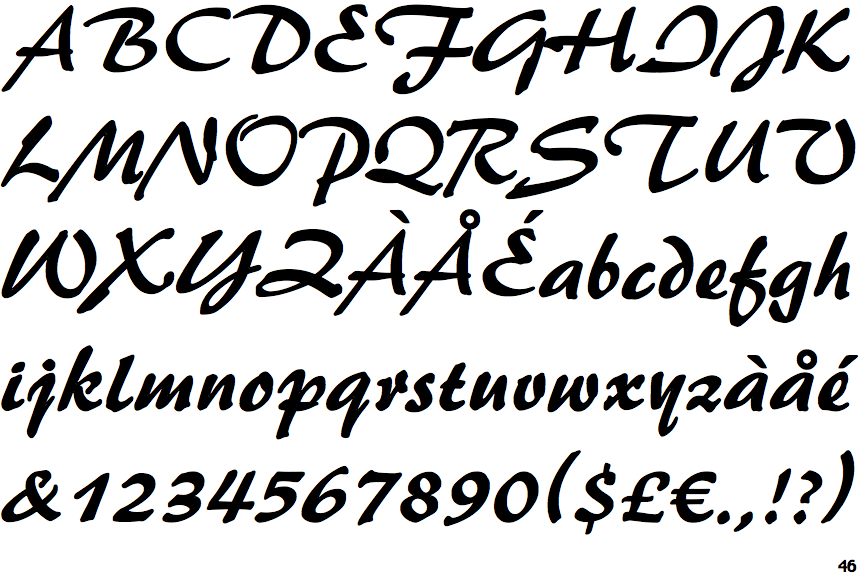
The upper-case 'Q' tail forms part of the stroke of an open circle.
|
 |
The '$' (dollar) has a single line which does not cross the 'S'.
|
 |
The upper-case 'J' descends below the baseline.
|
 |
The upper-case 'G' has no bar.
|
 |
The upper-case 'Y' right-hand arm forms a continuous stroke with the tail.
|
 |
The upper-case 'J' has a bar to the left.
|
 |
The upper-case 'E' is drawn as a single stroke (with or without loop).
|
 |
The centre bar of the upper-case 'R' leaves a gap with the vertical.
|
 |
The tail of the upper-case 'T' curves to the right.
|
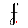 |
The stroke of the lower-case 'f' has a lower loop only.
|
There are more than ten differences; only the first ten are shown.
Note that the fonts in the icons shown above represent general examples, not necessarily the two fonts chosen for comparison.
Show Examples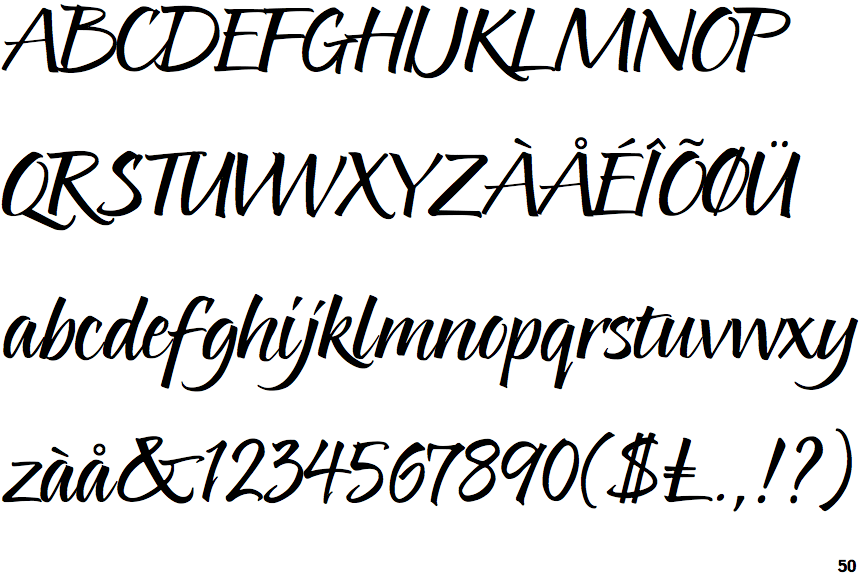
 |
The upper-case 'Q' tail touches the circle.
|
 |
The '$' (dollar) has a double line crossing the 'S'.
|
 |
The upper-case 'J' sits on the baseline.
|
 |
The upper-case 'G' has double-sided bar.
|
 |
The upper-case 'Y' arms and tail are separate strokes.
|
 |
The upper-case 'J' has no bar.
|
 |
The upper-case 'E' is normal letter shape.
|
 |
The centre bar of the upper-case 'R' meets the vertical.
|
 |
The tail of the upper-case 'T' is straight.
|
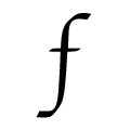 |
The stroke of the lower-case 'f' has no loops.
|