 |
The upper-case 'Q' tail touches the circle.
|
 |
The '&' (ampersand) is traditional style with two enclosed loops.
|
 |
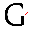
The upper-case 'G' has no spur/tail.
|
 |
The upper-case 'G' has a bar to the left.
|
 |
The leg of the upper-case 'R' is curved inwards.
|
 |
The bar of the upper-case 'G' is single-sided, left-facing.
|
 |
The upper-case 'L' has no loops.
|
 |
The tail of the upper-case 'T' is straight.
|
 |
The centre strokes of the upper-case 'W' form one centre stroke.
|
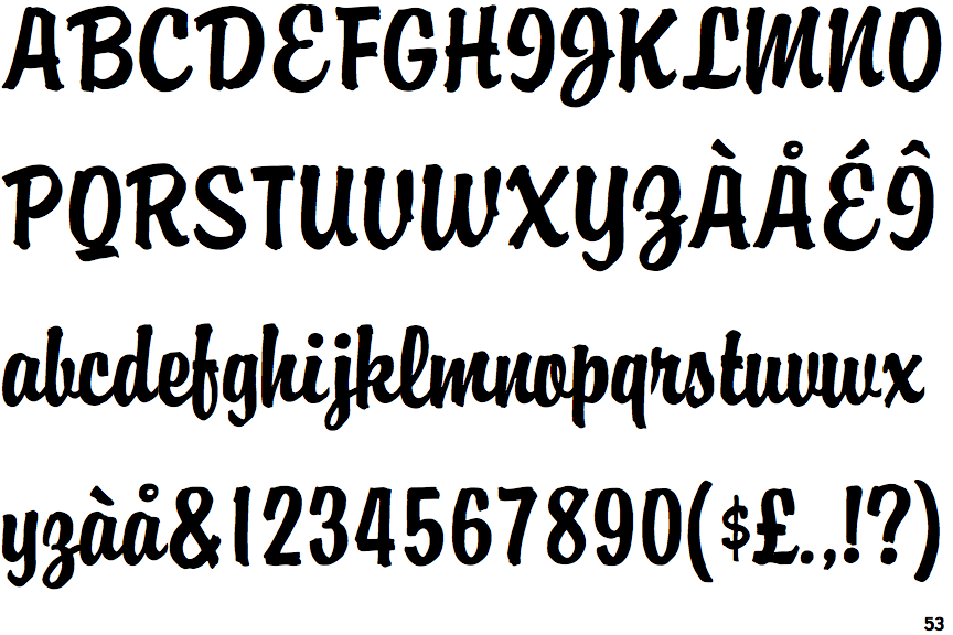
Note that the fonts in the icons shown above represent general examples, not necessarily the two fonts chosen for comparison.
Show Examples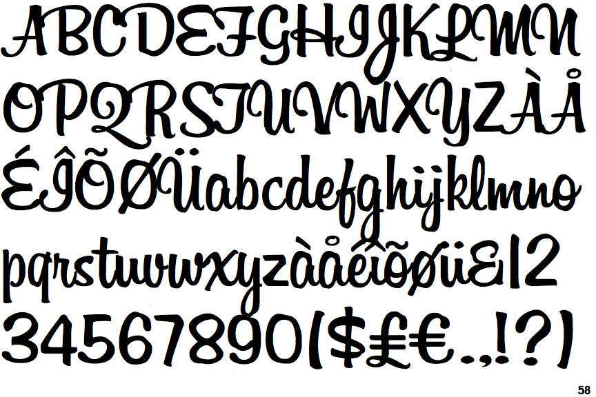
 |
The upper-case 'Q' tail forms part of the stroke of an open circle.
|
 |
The '&' (ampersand) looks like 'Et' with a gap at the top.
|
 |
The upper-case 'G' has a spur/tail.
|
|
The upper-case 'G' has no bar.
|
 |
The leg of the upper-case 'R' is curved outwards.
|
 |
The bar of the upper-case 'G' is no bar.
|
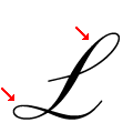 |
The upper-case 'L' has one upper and one lower loop.
|
 |
The tail of the upper-case 'T' curves to the left.
|
 |
The centre strokes of the upper-case 'W' meet at a vertex.
|