 |
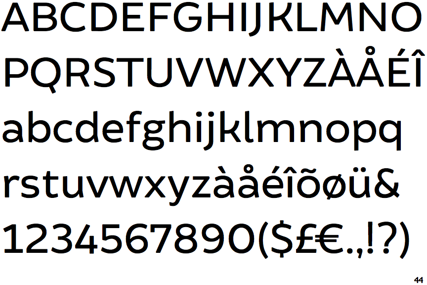
The upper-case 'J' descends below the baseline.
|
 |
The diagonal strokes of the upper-case 'K' meet in a 'T'.
|
 |
The centre vertex of the upper-case 'M' is above the baseline.
|
 |
The verticals of the upper-case 'M' are sloping.
|
 |
The leg of the upper-case 'R' is straight.
|
 |
The right side of the upper-case 'G' is curved.
|
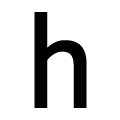 |
The lower-case 'h' has no exit stroke.
|
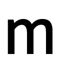 |
The 'm' has no exit stroke.
|
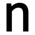 |
The 'n' has no exit stroke.
|
Note that the fonts in the icons shown above represent general examples, not necessarily the two fonts chosen for comparison.
Show Examples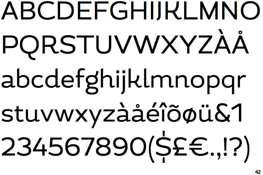
 |
The upper-case 'J' sits on the baseline.
|
 |
The diagonal strokes of the upper-case 'K' connect to the vertical via a horizontal bar.
|
 |
The centre vertex of the upper-case 'M' is on the baseline.
|
|
The verticals of the upper-case 'M' are parallel.
|
 |
The leg of the upper-case 'R' is curved inwards.
|
 |
The right side of the upper-case 'G' has a flat section.
|
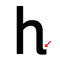 |
The lower-case 'h' has an exit stroke.
|
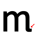 |
The 'm' has an exit stroke.
|
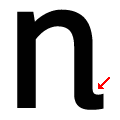 |
The 'n' has an exit stroke.
|