 |
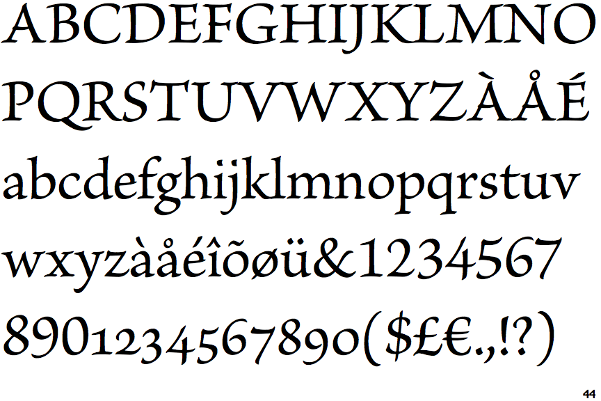
The upper-case 'Q' tail touches the circle.
|
 |
The '&' (ampersand) is traditional style with two enclosed loops.
|
 |
The '4' is open.
|
 |
The centre vertex of the upper-case 'M' is on the baseline.
|
 |
The upper-case 'G' foot has a forward pointing spur or serif.
|
 |
The top of the lower-case 'q' has a vertical or slightly angled spur (pointed or flat).
|
 |
The foot of the '4' has no serifs.
|
 |
The centre vertex of the upper-case 'W' has no serifs.
|
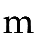 |
The feet of the lower-case 'm' have two serifs on the left and centre and one on the right.
|
 |
The foot of the '£' (pound) has no loop.
|
Note that the fonts in the icons shown above represent general examples, not necessarily the two fonts chosen for comparison.
Show Examples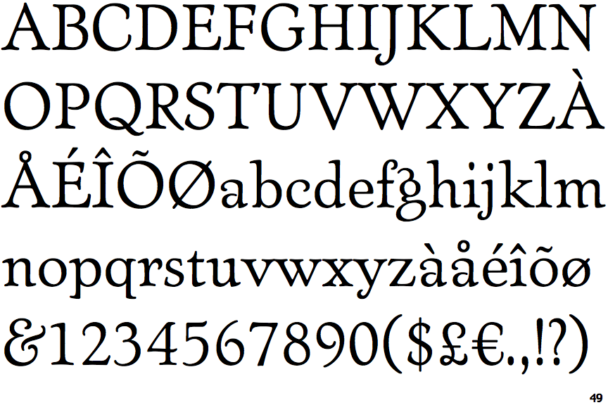
 |
The upper-case 'Q' tail crosses the circle.
|
 |
The '&' (ampersand) looks like 'Et' with a gap at the top.
|
 |
The '4' is closed.
|
 |
The centre vertex of the upper-case 'M' is above the baseline.
|
 |
The upper-case 'G' foot has no spur or serif.
|
 |
The top of the lower-case 'q' has a right-facing serif.
|
 |
The foot of the '4' has double-sided serifs.
|
 |
The centre vertex of the upper-case 'W' has two separate serifs.
|
 |
The feet of the lower-case 'm' have two serifs on the left, and one on the centre and right.
|
 |
The foot of the '£' (pound) has a loop.
|