 |
The upper-case 'J' sits on the baseline.
|
 |
The '4' is open.
|
 |
The diagonal strokes of the upper-case 'K' connect to the vertical via a horizontal bar.
|
 |
The verticals of the upper-case 'M' are sloping.
|
 |
The upper-case 'G' has a spur/tail.
|
 |
The upper-case 'J' has no bar.
|
 |
The upper-case letter 'I' is plain.
|
 |
The lower-case 'i' has no serifs or tail.
|
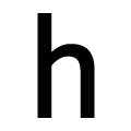 |
The lower-case 'h' has no exit stroke.
|
 |
The centre strokes of the upper-case 'W' meet at a vertex.
|
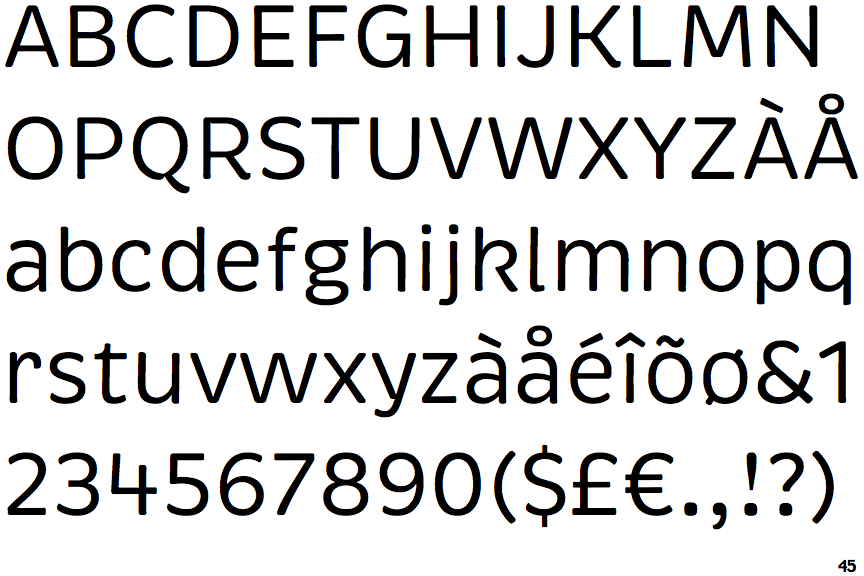
There are more than ten differences; only the first ten are shown.
Note that the fonts in the icons shown above represent general examples, not necessarily the two fonts chosen for comparison.
Show Examples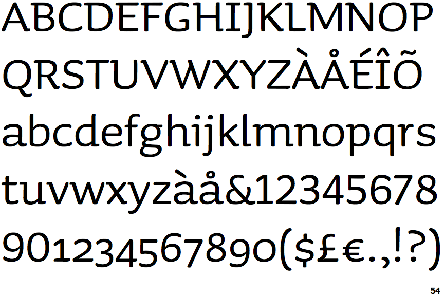
 |
The upper-case 'J' descends below the baseline.
|
 |
The '4' is closed.
|
 |
The diagonal strokes of the upper-case 'K' meet in a 'T'.
|
 |
The verticals of the upper-case 'M' are parallel.
|
 |
The upper-case 'G' has no spur/tail.
|
 |
The upper-case 'J' has a bar to the left.
|
 |
The upper-case letter 'I' has serifs/bars.
|
 |
The lower-case 'i' has a left-facing upper serif.
|
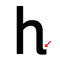 |
The lower-case 'h' has an exit stroke.
|
 |
The centre strokes of the upper-case 'W' meet in a T on the left.
|