 |
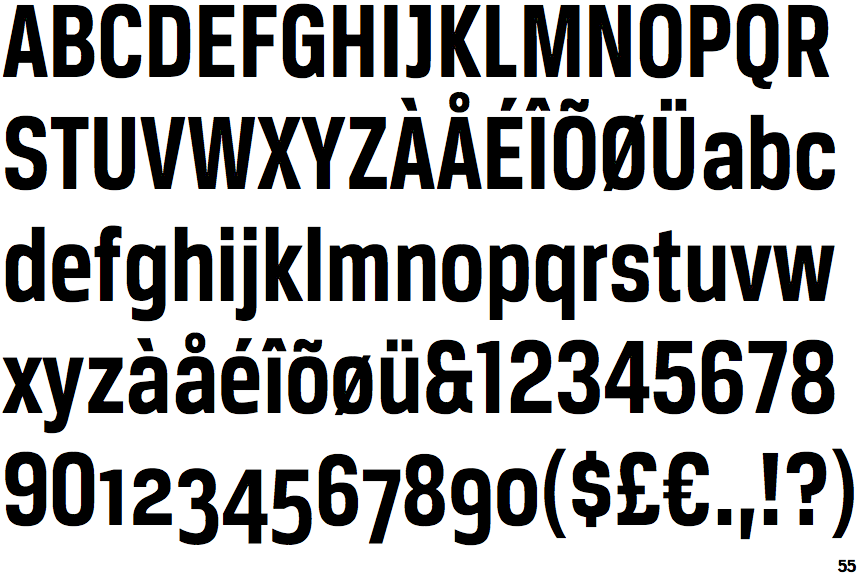
The upper-case 'Q' tail touches the circle.
|
 |
The '&' (ampersand) looks like 'Et' with one enclosed loop (with or without exit stroke).
|
 |
The upper-case 'J' sits on the baseline.
|
 |
The upper-case 'G' has a spur/tail.
|
 |
The upper-case 'G' has a bar to the left.
|
 |
The upper-case 'J' has a bar to the left.
|
 |
The leg of the upper-case 'R' is straight.
|
 |
The top of the lower-case 'q' has a vertical or slightly angled spur (pointed or flat).
|
 |
The dot on the lower-case 'i' or 'j' is square or rectangular.
|
 |
The tail of the lower-case 'y' is curved or U-shaped to the left.
|
There are more than ten differences; only the first ten are shown.
Note that the fonts in the icons shown above represent general examples, not necessarily the two fonts chosen for comparison.
Show Examples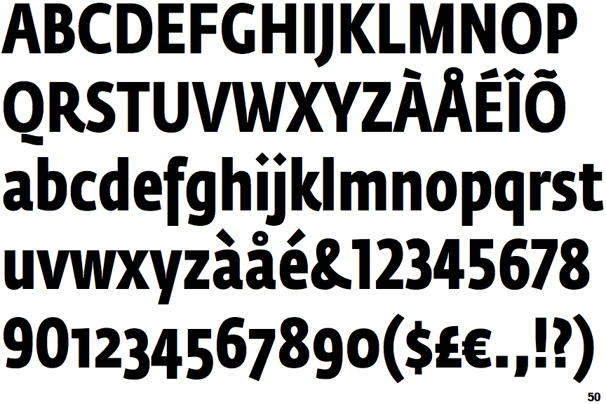
 |
The upper-case 'Q' tail is below and separated from the circle.
|
 |
The '&' (ampersand) is traditional style with two enclosed loops.
|
 |
The upper-case 'J' descends below the baseline.
|
 |
The upper-case 'G' has no spur/tail.
|
|
The upper-case 'G' has no bar.
|
 |
The upper-case 'J' has no bar.
|
 |
The leg of the upper-case 'R' is curved inwards.
|
 |
The top of the lower-case 'q' has no spur or serif.
|
 |
The dot on the lower-case 'i' or 'j' is diamond-shaped.
|
 |
The tail of the lower-case 'y' is substantially straight.
|