Identifont

Fonts by Appearance

Fonts by Name

Fonts by Similarity

Fonts by Picture

Fonts by Designer/Publisher

Differences

TweetTweet Differences

Compare: and  

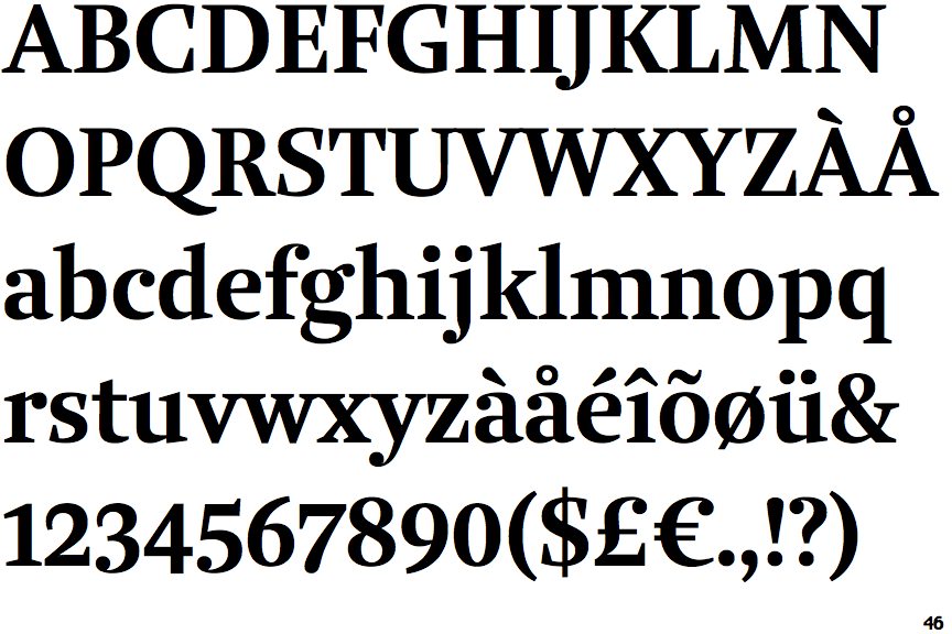
Brenta Bold

Brenta Bold

Sloping
The verticals of the upper-case 'M' are sloping.
Meets
The centre bar of the upper-case 'P' meets the vertical.
None
The foot of the '4' has no serifs.
Both
The centre vertex of the upper-case 'W' has two separate serifs.
Left
The bar of the upper-case 'G' is single-sided, left-facing.

Note that the fonts in the icons shown above represent general examples, not necessarily the two fonts chosen for comparison.

Show Examples
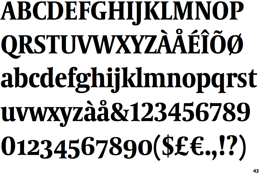
Coranto 2 Headline Bold

Coranto 2 Headline Bold

Parallel
The verticals of the upper-case 'M' are parallel.
Gap
The centre bar of the upper-case 'P' leaves a gap with the vertical.
Double
The foot of the '4' has double-sided serifs.
None
The centre vertex of the upper-case 'W' has no serifs.
Double
The bar of the upper-case 'G' is double-sided.