 |
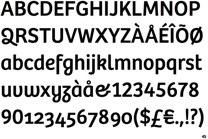
The upper-case 'Q' tail forms part of the stroke of an open circle.
|
 |
The top storey of the '3' is a smooth curve.
|
 |
The lower-case 'g' is single-storey (with or without loop).
|
 |
The lower-case 'a' stem stops at the top of the bowl (single storey).
|
 |
The upper-case 'G' has a bar to the left.
|
 |
The upper-case 'Y' arms and tail are separate strokes.
|
 |
The 'l' (lower-case 'L') has a right-facing lower serif or tail.
|
 |
The bar of the lower-case 'f' is single-sided.
|
 |
The tail of the lower-case 'f' descends below the baseline.
|
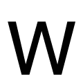 |
The upper-case 'W' vertices are flat at the top and bottom.
|
Note that the fonts in the icons shown above represent general examples, not necessarily the two fonts chosen for comparison.
Show Examples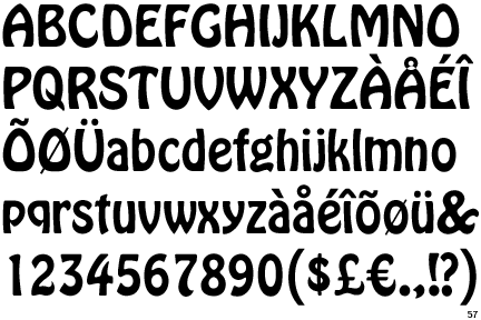
 |
The upper-case 'Q' tail crosses the circle.
|
 |
The top storey of the '3' is a sharp angle.
|
 |
The lower-case 'g' is double-storey (with or without gap).
|
 |
The lower-case 'a' stem curves over the top of the bowl (double storey).
|
 |
The upper-case 'G' has no bar.
|
 |
The upper-case 'Y' right-hand arm forms a continuous stroke with the tail.
|
 |
The 'l' (lower-case 'L') has no serifs or tail.
|
 |
The bar of the lower-case 'f' is double-sided.
|
 |
The tail of the lower-case 'f' sits on the baseline.
|
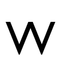 |
The upper-case 'W' vertices are flat at the top, pointed at the bottom.
|