Identifont

Fonts by Appearance

Fonts by Name

Fonts by Similarity

Fonts by Picture

Fonts by Designer/Publisher

Differences

TweetTweet Differences

Compare: and  

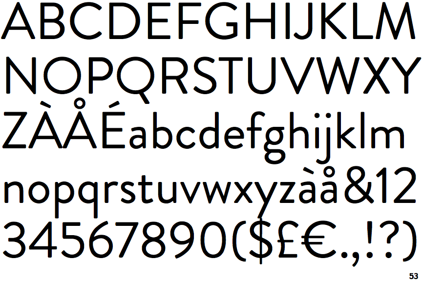
Brandon Grotesque

Brandon Grotesque

Closed
The '&' (ampersand) is traditional style with two enclosed loops.
Closed
The '4' is closed.
2-Storey
The lower-case 'g' is double-storey (with or without gap).
Closed
The centre bar of the upper-case 'R' meets the vertical.
Flat
The right side of the upper-case 'G' has a flat section.

Note that the fonts in the icons shown above represent general examples, not necessarily the two fonts chosen for comparison.

Show Examples
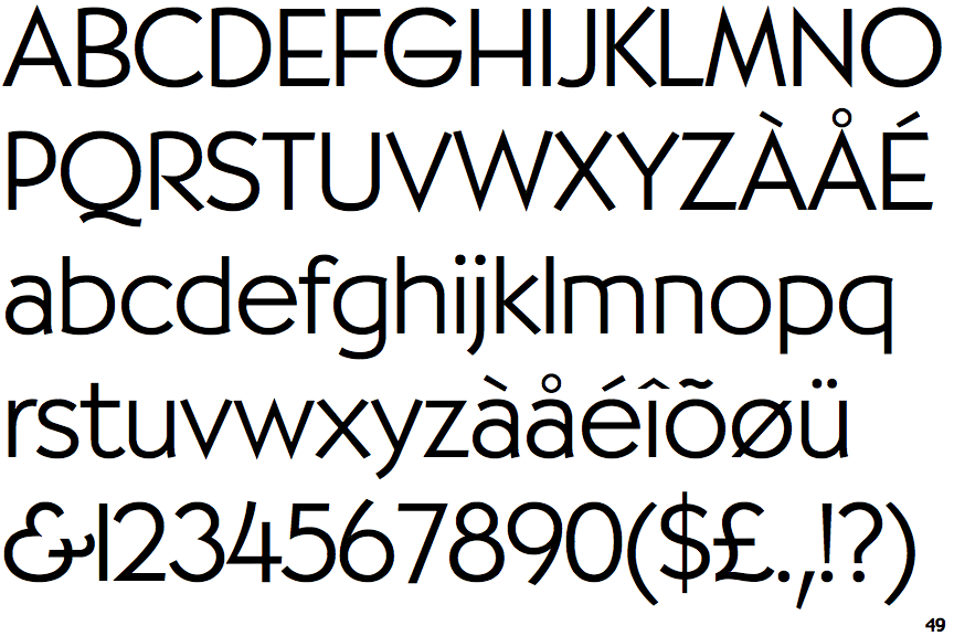
PL Bernhardt Light

PL Bernhardt Light

Gap top
The '&' (ampersand) looks like 'Et' with a gap at the top.
Open
The '4' is open.
1-Storey
The lower-case 'g' is single-storey (with or without loop).
Open
The centre bar of the upper-case 'R' leaves a gap with the vertical.
Curved
The right side of the upper-case 'G' is curved.