Identifont

Fonts by Appearance

Fonts by Name

Fonts by Similarity

Fonts by Picture

Fonts by Designer/Publisher

Differences

TweetTweet Differences

Compare: and  

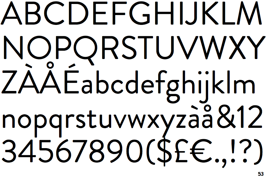
Brandon Grotesque

Brandon Grotesque

Touches
The upper-case 'Q' tail touches the circle.
Baseline
The centre vertex of the upper-case 'M' is on the baseline.
Sloping
The verticals of the upper-case 'M' are sloping.
No spur
The upper-case 'G' has no spur/tail.

Note that the fonts in the icons shown above represent general examples, not necessarily the two fonts chosen for comparison.

Show Examples
Omnes

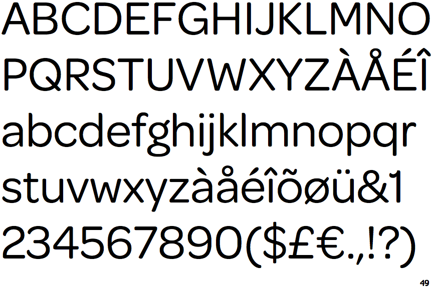
Omnes

Crosses
The upper-case 'Q' tail crosses the circle.
Above
The centre vertex of the upper-case 'M' is above the baseline.
Parallel
The verticals of the upper-case 'M' are parallel.
Spur
The upper-case 'G' has a spur/tail.