 |
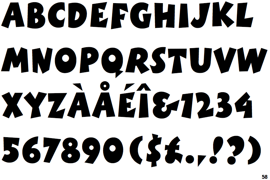
The '&' (ampersand) looks like 'Et' with a gap at the top.
|
 |
The centre vertex of the upper-case 'M' is above the baseline.
|
 |
The bar of the '4' does not cross the vertical.
|
 |
The centre strokes of the upper-case 'W' meet at a vertex.
|
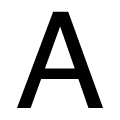 |
The bar of the upper-case 'A' is a single horizontal line.
|
Note that the fonts in the icons shown above represent general examples, not necessarily the two fonts chosen for comparison.
Show Examples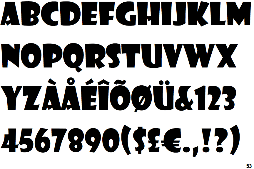
 |
The '&' (ampersand) is traditional style with a gap at the top.
|
 |
The centre vertex of the upper-case 'M' is on the baseline.
|
 |
The bar of the '4' crosses the vertical.
|
 |
The centre strokes of the upper-case 'W' meet in a T on the left.
|
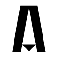 |
The bar of the upper-case 'A' is a triangle, V-shaped, diamond, or dot.
|