 |
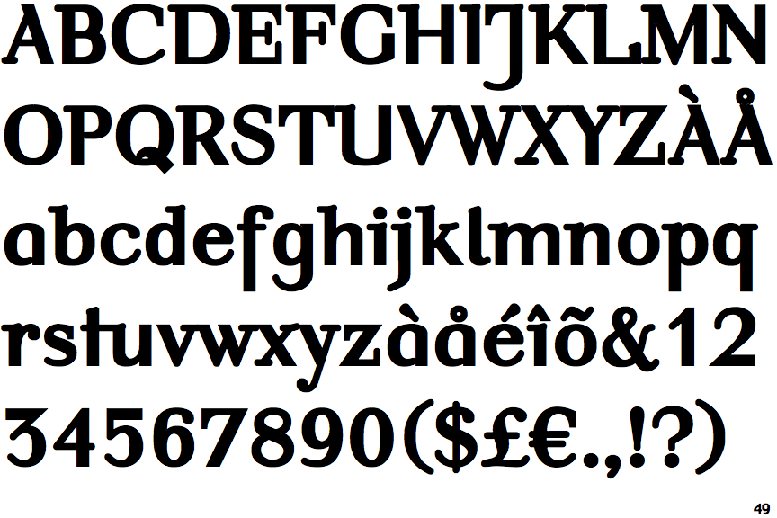
The upper-case 'J' descends below the baseline.
|
 |
The top storey of the '3' is a sharp angle.
|
 |
The lower-case 'g' is single-storey (with or without loop).
|
 |
The characters are solid.
|
 |
The top of the upper-case 'A' has a serif or cusp on the left.
|
 |
The top stroke of the upper-case 'C' has no upward-pointing serif.
|
 |
The upper-case 'A' has tapered verticals.
|
 |
The centre vertex of the upper-case 'W' has no serifs.
|
 |
The tail of the upper-case 'Q' is curved or S-shaped.
|
 |
The '7' has no bar.
|
Note that the fonts in the icons shown above represent general examples, not necessarily the two fonts chosen for comparison.
Show Examples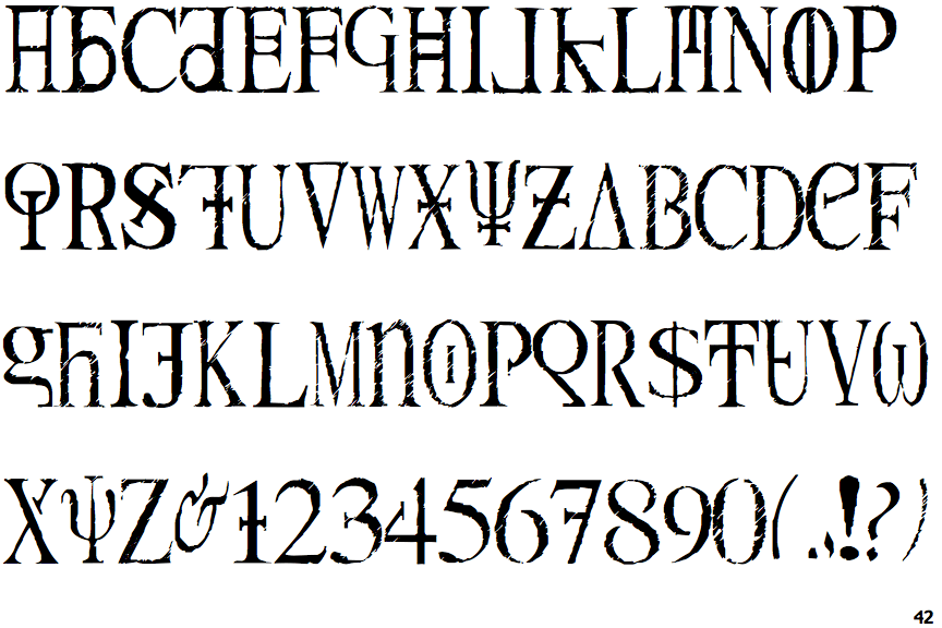
 |
The upper-case 'J' sits on the baseline.
|
 |
The top storey of the '3' is a smooth curve.
|
 |
The lower-case 'g' is double-storey (with or without gap).
|
 |
The characters are outlined, shaded, or filled with a pattern.
|
 |
The top of the upper-case 'A' has serifs both sides, or a top bar.
|
 |
The top stroke of the upper-case 'C' has a vertical or angled upward-pointing serif.
|
 |
The upper-case 'A' has parallel verticals.
|
 |
The centre vertex of the upper-case 'W' has two separate serifs.
|
 |
The tail of the upper-case 'Q' is straight.
|
 |
The '7' has a bar.
|