 |
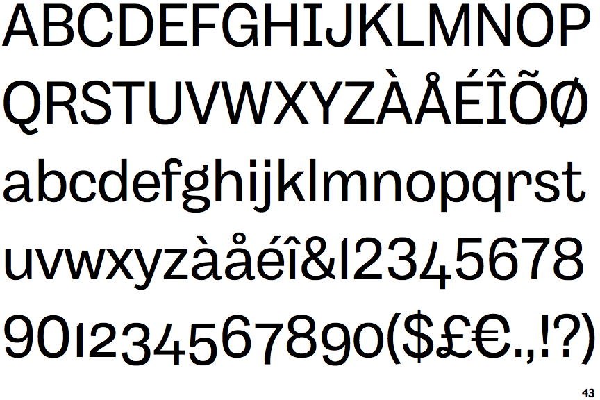
The upper-case letter 'I' has serifs/bars.
|
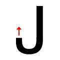 |
The tail of the upper-case 'J' points vertically.
|
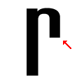 |
The arm of the lower-case 'r' points downwards.
|
Note that the fonts in the icons shown above represent general examples, not necessarily the two fonts chosen for comparison.
Show Examples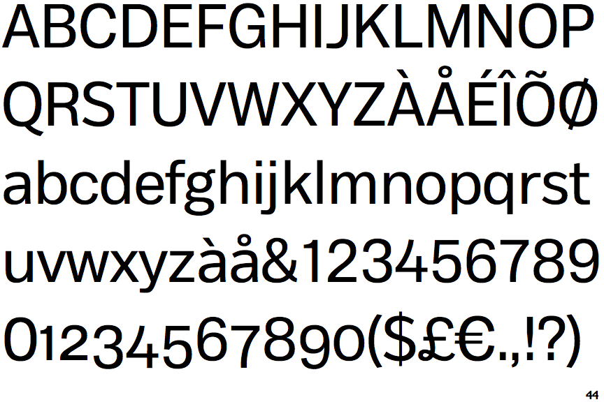
 |
The upper-case letter 'I' is plain.
|
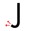 |
The tail of the upper-case 'J' points horizontally or slightly upwards.
|
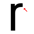 |
The arm of the lower-case 'r' points upwards or slightly downwards.
|