 |
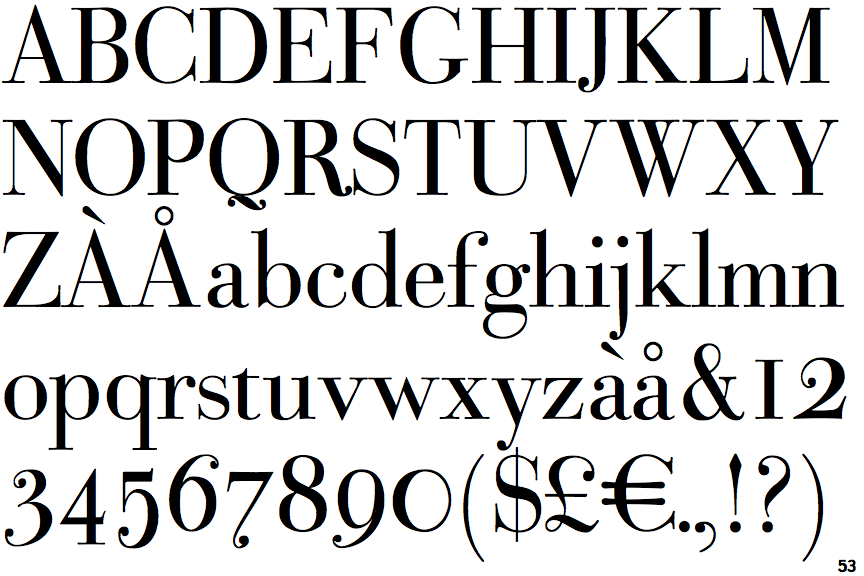
The '&' (ampersand) is traditional style with two enclosed loops.
|
 |
The verticals of the upper-case 'M' are parallel.
|
 |
The centre bar of the upper-case 'P' meets the vertical.
|
 |
The top stroke of the upper-case 'C' has a vertical or angled upward-pointing serif.
|
 |
The top of the upper-case 'W' has four upper terminals.
|
 |
The tail of the upper-case 'J' has a rounded end or ball.
|
 |
The top vertices of the upper-case 'M' have symmetrical single-sided serifs.
|
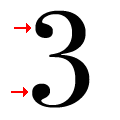 |
The '3' strokes are both terminated with balls.
|
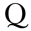 |
The tail of the upper-case 'Q' is double-sided.
|
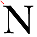 |
The top-left vertex of the upper-case 'N' has one serif.
|
There are more than ten differences; only the first ten are shown.
Note that the fonts in the icons shown above represent general examples, not necessarily the two fonts chosen for comparison.
Show Examples
 |
The '&' (ampersand) is traditional style with a gap at the top.
|
 |
The verticals of the upper-case 'M' are sloping.
|
 |
The centre bar of the upper-case 'P' leaves a gap with the vertical.
|
 |
The top stroke of the upper-case 'C' has no upward-pointing serif.
|
 |
The top of the upper-case 'W' has three upper terminals.
|
 |
The tail of the upper-case 'J' has a tapered end.
|
 |
The top vertices of the upper-case 'M' have no top serifs.
|
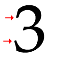 |
The '3' strokes are both plain (pointed or rounded).
|
 |
The tail of the upper-case 'Q' is single-sided.
|
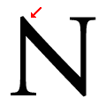 |
The top-left vertex of the upper-case 'N' has no serifs.
|