 |
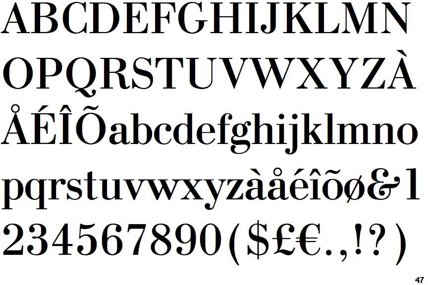
The '$' (dollar) has a single line crossing the 'S'.
|
 |
The '&' (ampersand) looks like 'Et' with a gap at the top.
|
 |
The upper-case 'J' sits on the baseline.
|
 |
The diagonal strokes of the upper-case 'K' meet in a 'T'.
|
 |
The top of the upper-case 'W' has three upper terminals.
|
 |
The top of the '7' has no serif or bar.
|
 |
The bar of the '4' has no serifs or spur.
|
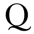 |
The tail of the upper-case 'Q' is double-sided.
|
 |
The foot of the '£' (pound) has no loop.
|
Note that the fonts in the icons shown above represent general examples, not necessarily the two fonts chosen for comparison.
Show Examples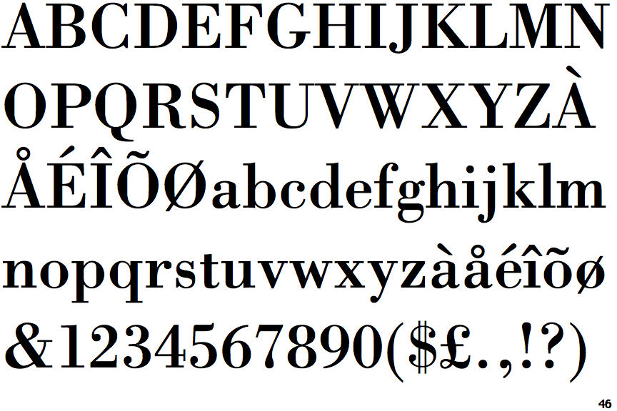
 |
The '$' (dollar) has a double line crossing the 'S'.
|
 |
The '&' (ampersand) is traditional style with two enclosed loops.
|
 |
The upper-case 'J' descends below the baseline.
|
 |
The diagonal strokes of the upper-case 'K' meet at the vertical (with or without a gap).
|
 |
The top of the upper-case 'W' has four upper terminals.
|
 |
The top of the '7' has a downward-pointing serif or bar.
|
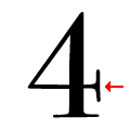 |
The bar of the '4' has double serifs.
|
 |
The tail of the upper-case 'Q' is single-sided.
|
 |
The foot of the '£' (pound) has a loop.
|