 |
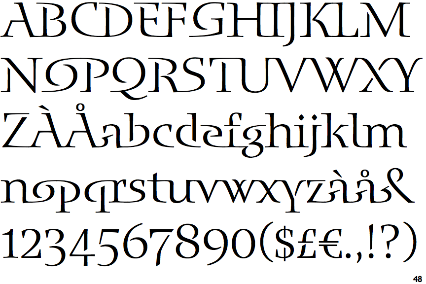
The upper-case 'Q' tail forms part of the stroke of an open circle.
|
 |
The '4' is closed.
|
 |
The characters are solid.
|
 |
The top stroke of the upper-case 'C' has no upward-pointing serif.
|
 |
The centre bar of the upper-case 'E' has serifs.
|
 |
The top of the upper-case 'W' has four upper terminals.
|
 |
The centre bar of the upper-case 'F' has serifs.
|
Note that the fonts in the icons shown above represent general examples, not necessarily the two fonts chosen for comparison.
Show Examples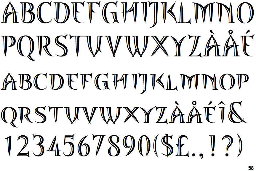
 |
The upper-case 'Q' tail touches the circle.
|
 |
The '4' is open.
|
 |
The characters are outlined, shaded, or filled with a pattern.
|
 |
The top stroke of the upper-case 'C' has a vertical or angled upward-pointing serif.
|
 |
The centre bar of the upper-case 'E' has no serifs.
|
 |
The top of the upper-case 'W' has three upper terminals.
|
 |
The centre bar of the upper-case 'F' has no serifs.
|