 |
The '&' (ampersand) is traditional style with two enclosed loops.
|
 |
The top storey of the '3' is a sharp angle.
|
 |
The upper-case 'G' has no spur/tail.
|
 |
The upper-case 'G' has a bar to the left.
|
 |
The tail of the lower-case 'y' is curved or U-shaped to the left.
|
 |
The bar of the lower-case 'f' is double-sided.
|
 |
The tail of the lower-case 'j' is curved with no upper serif.
|
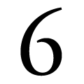 |
The bowl of the '6' leaves a gap with the vertical.
|
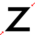 |
The vertices of the lower-case 'z' are pointed.
|
Note that the fonts in the icons shown above represent general examples, not necessarily the two fonts chosen for comparison.
Show Examples
 |
The '&' (ampersand) looks like 'Et' with a gap at the top.
|
 |
The top storey of the '3' is a smooth curve.
|
 |
The upper-case 'G' has a spur/tail.
|
|
The upper-case 'G' has no bar.
|
 |
The tail of the lower-case 'y' is substantially straight.
|
 |
The bar of the lower-case 'f' is single-sided.
|
 |
The tail of the lower-case 'j' is straight with no upper serif.
|
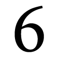 |
The bowl of the '6' meets the vertical.
|
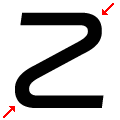 |
The vertices of the lower-case 'z' are rounded.
|