 |
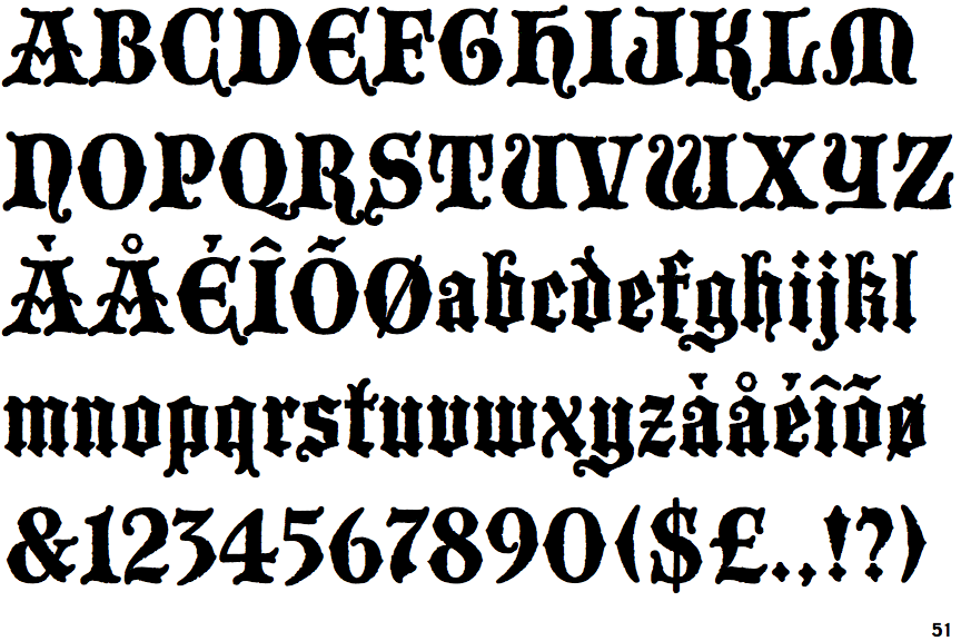
The '&' (ampersand) is traditional style with two enclosed loops.
|
 |
The upper-case 'J' sits on the baseline.
|
 |
The '4' is closed.
|
 |
The top storey of the '3' is a sharp angle.
|
 |
The lower-case 'a' stem curves over the top of the bowl (double storey).
|
 |
The top of the upper-case 'A' has serifs both sides, or a top bar.
|
 |
The tail of the upper-case 'T' is straight.
|
 |
The tail of the lower-case 'f' sits on the baseline.
|
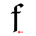 |
The tail of the lower-case 'f' is angled.
|
 |
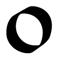
The lower-case 'o' is hexagonal, with straight sides (Textura or Gotisch).
|
Note that the fonts in the icons shown above represent general examples, not necessarily the two fonts chosen for comparison.
Show Examples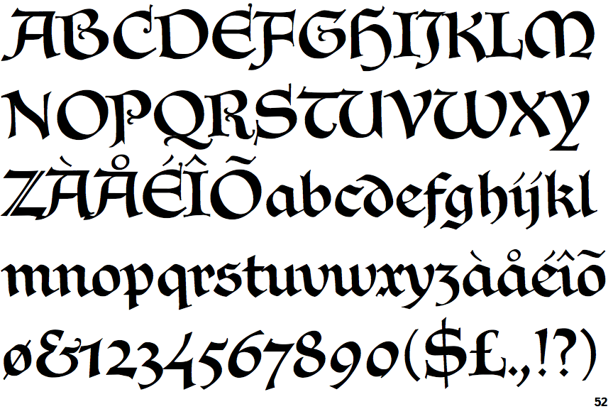
 |
The '&' (ampersand) looks like 'Et' with a gap at the top.
|
 |
The upper-case 'J' descends below the baseline.
|
 |
The '4' is open.
|
 |
The top storey of the '3' is a smooth curve.
|
 |
The lower-case 'a' stem stops at the top of the bowl (single storey).
|
 |
The top of the upper-case 'A' has a serif or cusp on the left.
|
 |
The tail of the upper-case 'T' curves to the right.
|
 |
The tail of the lower-case 'f' descends below the baseline.
|
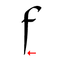 |
The tail of the lower-case 'f' is vertically pointed.
|
 |
The lower-case 'o' is smooth, circular (Rotunda).
|