 |
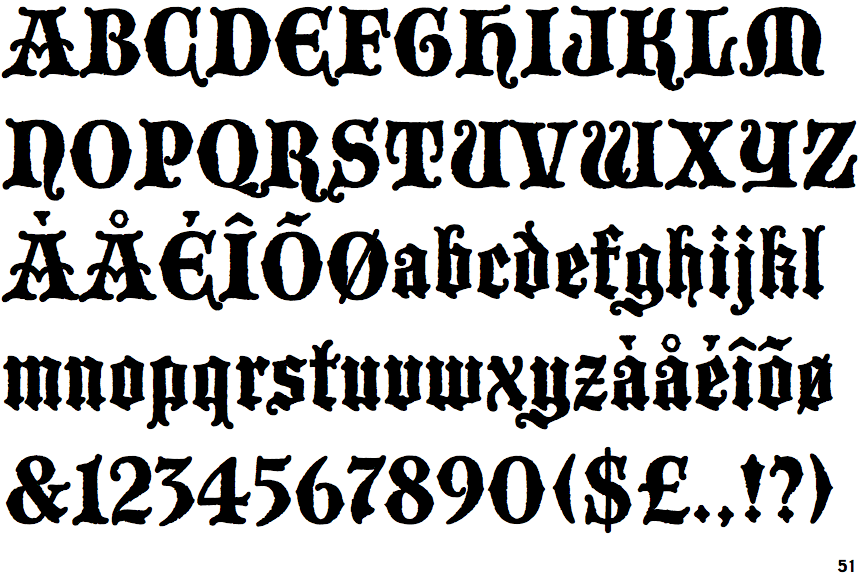
The upper-case 'Q' tail touches the circle.
|
 |
The characters have serifs.
|
 |
The top storey of the '3' is a sharp angle.
|
 |
The centre bar of the upper-case 'P' leaves a gap with the vertical.
|
 |
The upper-case 'Y' right-hand arm forms a continuous stroke with the tail.
|
 |
The upper-case 'E' is drawn as a 'C' with a bar.
|
 |
The '7' has no bar.
|
 |
The characters are blackletter.
|
 |
The tail of the upper-case 'T' is straight.
|
 |
The upper-case 'I' is a single stroke with serifs.
|
Note that the fonts in the icons shown above represent general examples, not necessarily the two fonts chosen for comparison.
Show Examples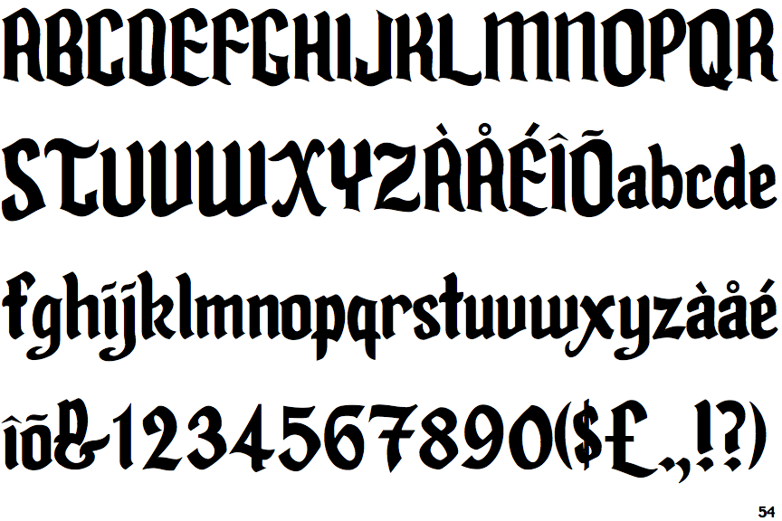
 |
The upper-case 'Q' tail crosses the circle.
|
 |
The characters do not have serifs.
|
 |
The top storey of the '3' is a smooth curve.
|
 |
The centre bar of the upper-case 'P' meets the vertical.
|
 |
The upper-case 'Y' arms and tail are separate strokes.
|
 |
The upper-case 'E' is normal letter shape.
|
 |
The '7' has a bar.
|
|
The characters are plain.
|
 |
The tail of the upper-case 'T' curves to the right.
|
 |
The upper-case 'I' is a single stroke with no serifs.
|