 |
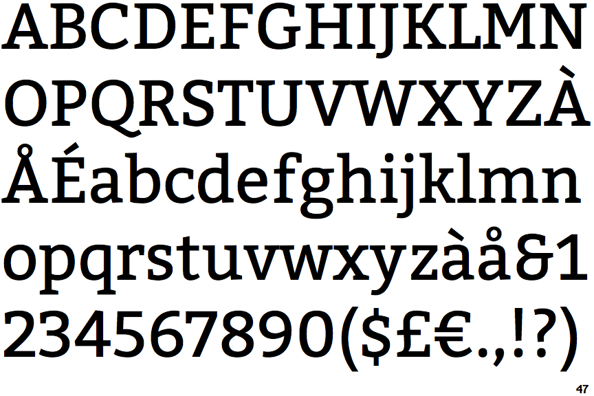
The '$' (dollar) has a single line which does not cross the 'S'.
|
 |
The centre vertex of the upper-case 'M' is above the baseline.
|
 |
The lower-case 'g' is double-storey (with or without gap).
|
 |
The centre bar of the upper-case 'E' has no serifs.
|
 |
The sides of the lower-case 'y' are angled (V-shaped).
|
 |
The centre bar of the upper-case 'F' has no serifs.
|
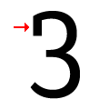 |
The '3' has an upper serif.
|
Note that the fonts in the icons shown above represent general examples, not necessarily the two fonts chosen for comparison.
Show Examples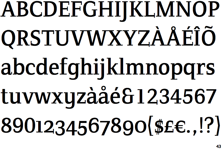
 |
The '$' (dollar) has a double line crossing the 'S'.
|
 |
The centre vertex of the upper-case 'M' is on the baseline.
|
 |
The lower-case 'g' is single-storey (with or without loop).
|
 |
The centre bar of the upper-case 'E' has serifs.
|
 |
The sides of the lower-case 'y' are parallel (U-shaped).
|
 |
The centre bar of the upper-case 'F' has serifs.
|
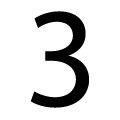 |
The '3' has no serifs.
|