 |
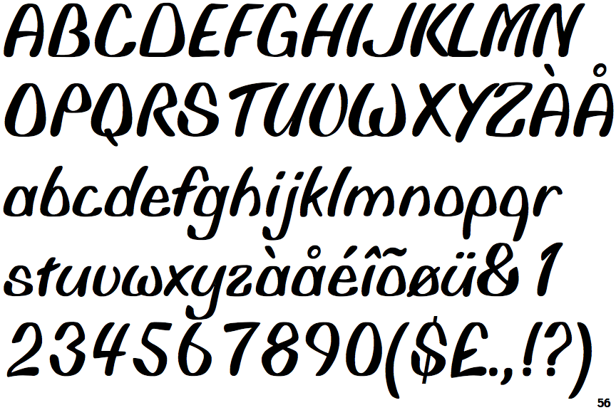
The diagonal strokes of the upper-case 'K' meet at the vertical (with or without a gap).
|
 |
The verticals of the upper-case 'M' are parallel.
|
 |
The top storey of the '3' is a smooth curve.
|
 |
The upper-case 'U' has a stem/serif.
|
 |
The upper-case 'G' has a spur/tail.
|
 |
The upper-case 'Y' right-hand arm forms a continuous stroke with the tail.
|
 |
The upper-case 'J' has no bar.
|
 |
The centre bar of the upper-case 'R' leaves a gap with the vertical.
|
 |
The strokes are sloped right (italic, oblique, or cursive).
|
 |
The '7' has no bar.
|
There are more than ten differences; only the first ten are shown.
Note that the fonts in the icons shown above represent general examples, not necessarily the two fonts chosen for comparison.
Show Examples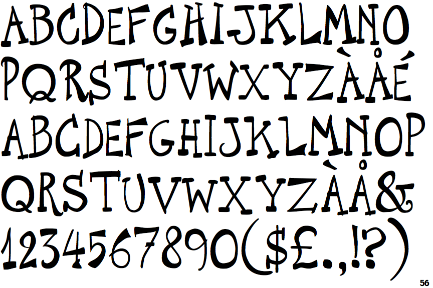
 |
The diagonal strokes of the upper-case 'K' meet in a 'T'.
|
 |
The verticals of the upper-case 'M' are sloping.
|
 |
The top storey of the '3' is a sharp angle.
|
 |
The upper-case 'U' has no stem/serif.
|
 |
The upper-case 'G' has no spur/tail.
|
 |
The upper-case 'Y' arms and tail are separate strokes.
|
 |
The upper-case 'J' has a bar both sides.
|
 |
The centre bar of the upper-case 'R' crosses the vertical.
|
 |
The strokes are upright.
|
 |
The '7' has a bar.
|