 |
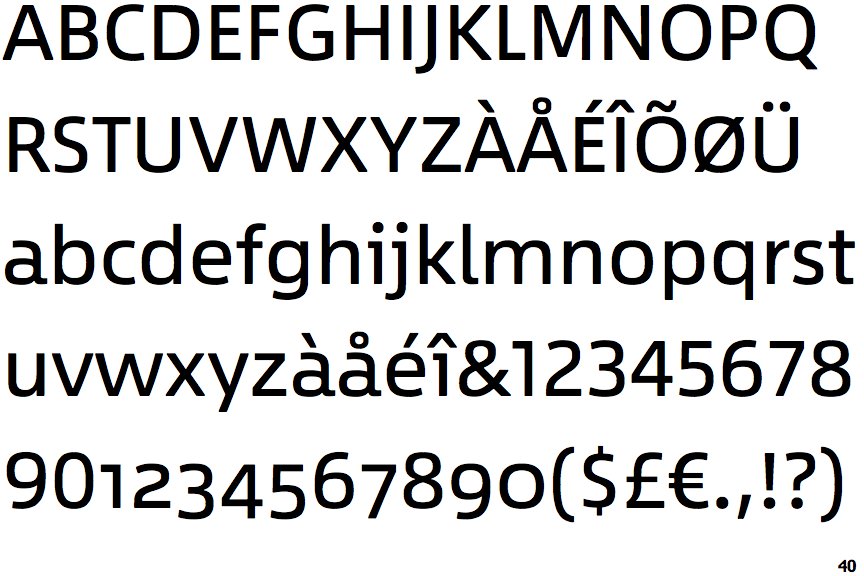
The verticals of the upper-case 'M' are parallel.
|
 |
The lower-case 'g' is single-storey (with or without loop).
|
 |
The tail of the lower-case 'y' is substantially straight.
|
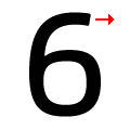 |
The arm of the '6' points horizontally or almost horizontally.
|
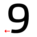 |
The tail of the '9' points horizontally or almost horizontally.
|
Note that the fonts in the icons shown above represent general examples, not necessarily the two fonts chosen for comparison.
Show Examples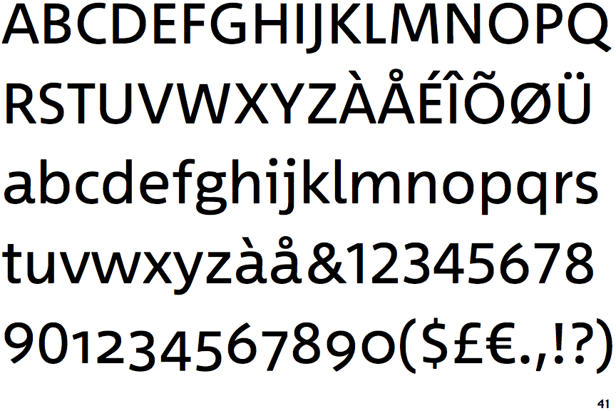
 |
The verticals of the upper-case 'M' are sloping.
|
 |
The lower-case 'g' is double-storey (with or without gap).
|
 |
The tail of the lower-case 'y' is curved or U-shaped to the left.
|
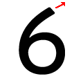 |
The arm of the '6' points upwards.
|
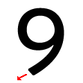 |
The tail of the '9' points downwards.
|