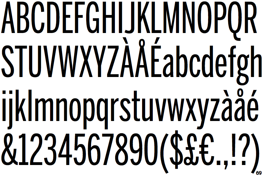
 |
The tail of the upper-case 'Q' is curved, S-shaped, or Z-shaped.
|
 |
The '1' (digit one) has double-sided base or serifs.
|
 |
The top of the '7' has no serif or bar.
|
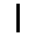 |
The top of the 'l' (lower-case 'L') is flat.
|
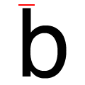 |
The top of the lower-case 'b' ascender is flat.
|
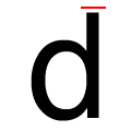 |
The top of the lower-case 'd' ascender is flat.
|
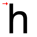 |
The top of the lower-case 'h' ascender is flat.
|
Note that the fonts in the icons shown above represent general examples, not necessarily the two fonts chosen for comparison.
Show Examples
 |
The tail of the upper-case 'Q' is straight (horizontal, diagonal, or vertical).
|
 |
The '1' (digit one) has no base.
|
 |
The top of the '7' has a downward-pointing serif or bar.
|
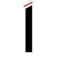 |
The top of the 'l' (lower-case 'L') is angled upwards.
|
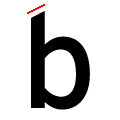 |
The top of the lower-case 'b' ascender is angled upwards.
|
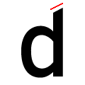 |
The top of the lower-case 'd' ascender is angled upwards.
|
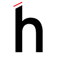 |
The top of the lower-case 'h' ascender is angled upwards.
|