 |
The upper-case 'Q' tail touches the circle.
|
 |
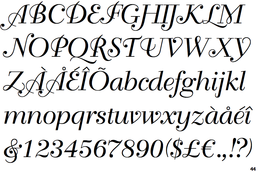
The characters have serifs.
|
 |
The verticals of the upper-case 'M' are parallel.
|
 |
The centre bar of the upper-case 'P' meets the vertical.
|
 |
The lower-case 'g' is double-storey (with or without gap).
|
 |
The upper-case 'U' has no stem/serif.
|
 |
The upper-case 'L' has one lower loop only.
|
 |
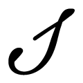
The tail of the upper-case 'T' is straight.
|
 |
The lower-case 's' is normal letter shape.
|
 |
The upper-case 'C' has no loops.
|
Note that the fonts in the icons shown above represent general examples, not necessarily the two fonts chosen for comparison.
Show Examples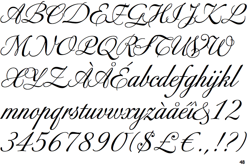
 |
The upper-case 'Q' tail crosses the circle.
|
 |
The characters do not have serifs.
|
 |
The verticals of the upper-case 'M' are sloping.
|
 |
The centre bar of the upper-case 'P' crosses the vertical.
|
 |
The lower-case 'g' is single-storey (with or without loop).
|
 |
The upper-case 'U' has a stem/serif.
|
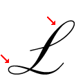 |
The upper-case 'L' has one upper and one lower loop.
|
 |
The tail of the upper-case 'T' curves to the right.
|
 |
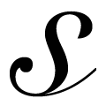
The lower-case 's' is italic script shape.
|
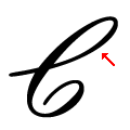 |
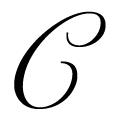
The upper-case 'C' has only an upper loop with no curl.
|