 |
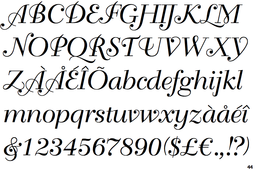
The '$' (dollar) has a single line crossing the 'S'.
|
 |
The '&' (ampersand) is traditional style with two enclosed loops.
|
 |
The '4' is closed.
|
 |
The verticals of the upper-case 'M' are parallel.
|
 |
The top of the upper-case 'W' has an open loop.
|
 |
The foot of the '4' has double-sided serifs.
|
 |
The tail of the upper-case 'J' has a rounded end or ball.
|
 |
The sides of the lower-case 'y' are parallel (U-shaped).
|
 |
The bar of the upper-case 'G' is double-sided.
|
 |
The lower storey of the lower-case 'g' has no gap.
|
There are more than ten differences; only the first ten are shown.
Note that the fonts in the icons shown above represent general examples, not necessarily the two fonts chosen for comparison.
Show Examples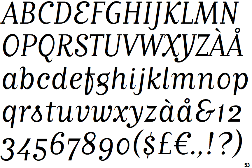
 |
The '$' (dollar) has a single line which does not cross the 'S'.
|
 |
The '&' (ampersand) looks like 'Et' with a gap at the top.
|
 |
The '4' is open.
|
 |
The verticals of the upper-case 'M' are sloping.
|
 |
The top of the upper-case 'W' has three upper terminals.
|
 |
The foot of the '4' has no serifs.
|
 |
The tail of the upper-case 'J' has a tapered end.
|
 |
The sides of the lower-case 'y' are angled (V-shaped).
|
 |
The bar of the upper-case 'G' is single-sided, left-facing.
|
 |
The lower storey of the lower-case 'g' has a gap.
|