 |
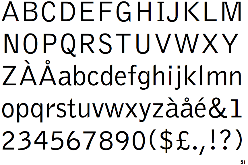
The upper-case 'Q' tail crosses the circle.
|
 |
The '$' (dollar) has a single line crossing the 'S'.
|
 |
The diagonal strokes of the upper-case 'K' meet at the vertical (with or without a gap).
|
 |
The dot on the '?' (question-mark) is circular or oval.
|
 |
The top storey of the '3' is a smooth curve.
|
 |
The lower-case 'g' is single-storey (with or without loop).
|
 |
The leg of the upper-case 'R' is straight.
|
 |
The '1' (digit one) has double-sided base or serifs.
|
 |
The upper-case letter 'I' has serifs/bars.
|
 |
The diagonal strokes of the lower-case 'k' meet at the vertical (with or without a gap).
|
There are more than ten differences; only the first ten are shown.
Note that the fonts in the icons shown above represent general examples, not necessarily the two fonts chosen for comparison.
Show Examples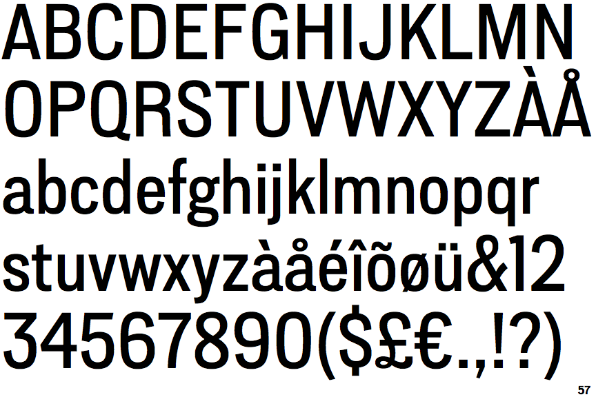
 |
The upper-case 'Q' tail touches the circle.
|
 |
The '$' (dollar) has a single line which does not cross the 'S'.
|
 |
The diagonal strokes of the upper-case 'K' meet in a 'T'.
|
 |
The dot on the '?' (question-mark) is square or rectangular.
|
 |
The top storey of the '3' is a sharp angle.
|
 |
The lower-case 'g' is double-storey (with or without gap).
|
 |
The leg of the upper-case 'R' is curved outwards.
|
 |
The '1' (digit one) has no base.
|
 |
The upper-case letter 'I' is plain.
|
 |
The diagonal strokes of the lower-case 'k' meet in a 'T'.
|