 |
The '4' is closed.
|
 |
The diagonal strokes of the upper-case 'K' meet at the vertical (with or without a gap).
|
 |
The centre vertex of the upper-case 'M' is on the baseline.
|
 |
The top storey of the '3' is a smooth curve.
|
 |
The lower-case 'g' is single-storey (with or without loop).
|
 |
The upper-case 'J' has no bar.
|
 |
The dot on the lower-case 'i' or 'j' is square or rectangular.
|
 |
The upper-case letter 'I' has serifs/bars.
|
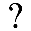 |
The '?' (question-mark) is hook-shaped.
|
 |
The top of the upper-case 'W' has three upper terminals.
|
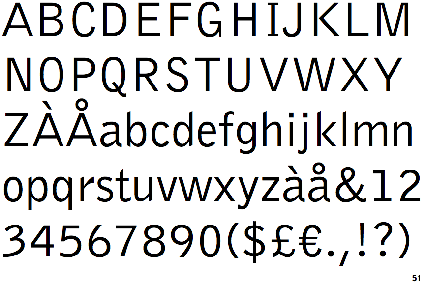
Note that the fonts in the icons shown above represent general examples, not necessarily the two fonts chosen for comparison.
Show Examples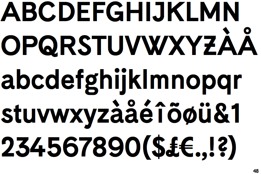
 |
The '4' is open.
|
 |
The diagonal strokes of the upper-case 'K' meet in a 'T'.
|
 |
The centre vertex of the upper-case 'M' is above the baseline.
|
 |
The top storey of the '3' is a sharp angle.
|
 |
The lower-case 'g' is double-storey (with or without gap).
|
 |
The upper-case 'J' has a bar to the left.
|
 |
The dot on the lower-case 'i' or 'j' is circular or oval.
|
 |
The upper-case letter 'I' is plain.
|
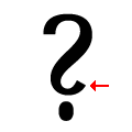 |
The '?' (question-mark) is like a backwards 'S'.
|
 |
The top of the upper-case 'W' has four upper terminals.
|