 |
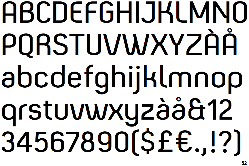
The '&' (ampersand) looks like 'Et' with one enclosed loop (with or without exit stroke).
|
 |
The centre vertex of the upper-case 'M' is above the baseline.
|
 |
The dot on the '?' (question-mark) is circular or oval.
|
 |
The lower-case 'a' stem curves over the top of the bowl (double storey).
|
 |
The 'l' (lower-case 'L') has a right-facing lower serif or tail.
|
 |
The leg of the upper-case 'R' is curved outwards.
|
 |
The dot on the lower-case 'i' or 'j' is circular or oval.
|
 |
The bar of the lower-case 'f' is double-sided.
|
 |
The lower-case 'u' has no stem/serif.
|
 |
The upper-case letter 'I' is plain.
|
There are more than ten differences; only the first ten are shown.
Note that the fonts in the icons shown above represent general examples, not necessarily the two fonts chosen for comparison.
Show Examples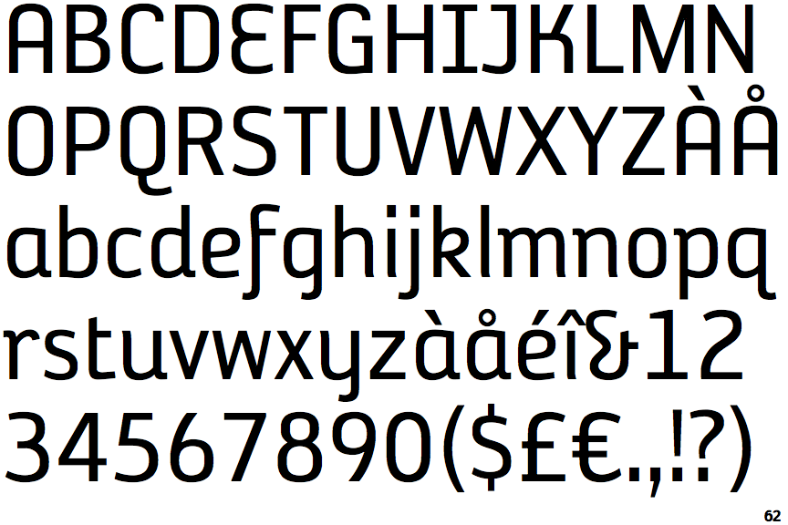
 |
The '&' (ampersand) looks like 'Et' with a gap at the top.
|
 |
The centre vertex of the upper-case 'M' is on the baseline.
|
 |
The dot on the '?' (question-mark) is square or rectangular.
|
 |
The lower-case 'a' stem stops at the top of the bowl (single storey).
|
 |
The 'l' (lower-case 'L') has no serifs or tail.
|
 |
The leg of the upper-case 'R' is straight.
|
 |
The dot on the lower-case 'i' or 'j' is square or rectangular.
|
 |
The bar of the lower-case 'f' is single-sided.
|
 |
The lower-case 'u' has a stem/serif.
|
 |
The upper-case letter 'I' has serifs/bars.
|