 |
The upper-case 'Q' tail touches the circle.
|
 |
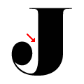
The upper-case 'J' descends below the baseline.
|
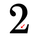 |
The base of the '2' is straight.
|
 |
The foot of the '£' (pound) has a loop.
|
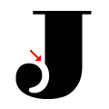 |
The left side of the upper-case 'J' tail is tapered in.
|
Note that the fonts in the icons shown above represent general examples, not necessarily the two fonts chosen for comparison.
Show Examples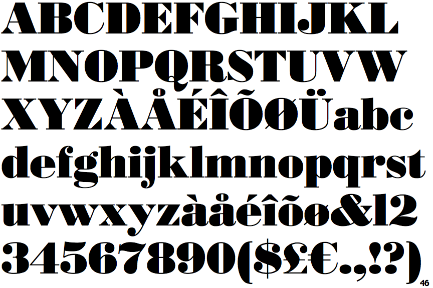
 |
The upper-case 'Q' tail crosses the circle.
|
 |
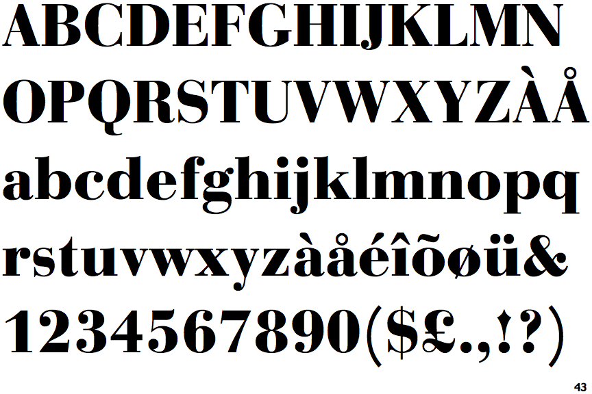
The upper-case 'J' sits on the baseline.
|
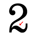 |
The base of the '2' is curved.
|
 |
The foot of the '£' (pound) has no loop.
|
 |
The left side of the upper-case 'J' tail is smooth.
|