 |
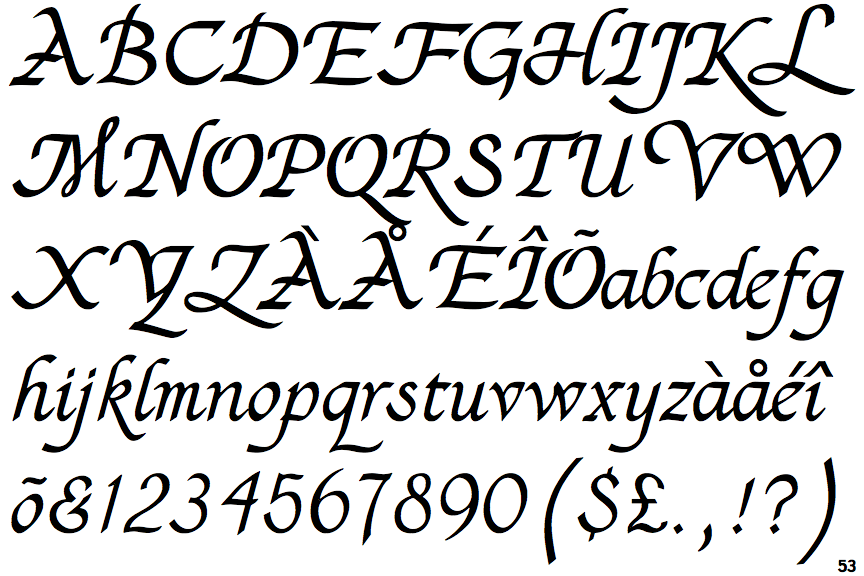
The '$' (dollar) has a single line which does not cross the 'S'.
|
 |
The '&' (ampersand) looks like 'Et' with a gap at the top.
|
 |
The centre bar of the upper-case 'P' meets the vertical.
|
 |
The upper-case 'G' has a bar to the left.
|
 |
The top of the upper-case 'A' has a serif or cusp on the left.
|
 |
The upper-case 'J' has a bar to the left.
|
 |
The sides of the lower-case 'y' are parallel (U-shaped).
|
 |
The bar of the upper-case 'G' is single-sided, left-facing.
|
 |
The lower-case 'e' has a straight angled bar.
|
 |
The upper-case 'I' is Z-shaped.
|
Note that the fonts in the icons shown above represent general examples, not necessarily the two fonts chosen for comparison.
Show Examples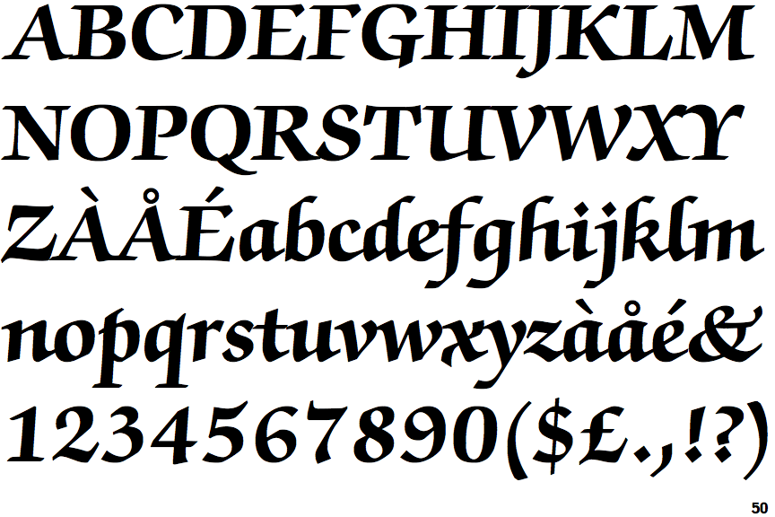
 |
The '$' (dollar) has a single line crossing the 'S'.
|
 |
The '&' (ampersand) is traditional style with two enclosed loops.
|
 |
The centre bar of the upper-case 'P' leaves a gap with the vertical.
|
 |
The upper-case 'G' has double-sided bar.
|
 |
The top of the upper-case 'A' has no serifs or cusps.
|
 |
The upper-case 'J' has a bar both sides.
|
 |
The sides of the lower-case 'y' are angled (V-shaped).
|
 |
The bar of the upper-case 'G' is double-sided.
|
 |
The lower-case 'e' has a curved bar with no straight segment.
|
 |
The upper-case 'I' is a single stroke with serifs.
|