 |
The upper-case 'U' left-hand stroke is visibly thicker.
|
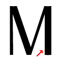 |
The upper-case 'M' vertical right-hand stroke is visibly thicker.
|
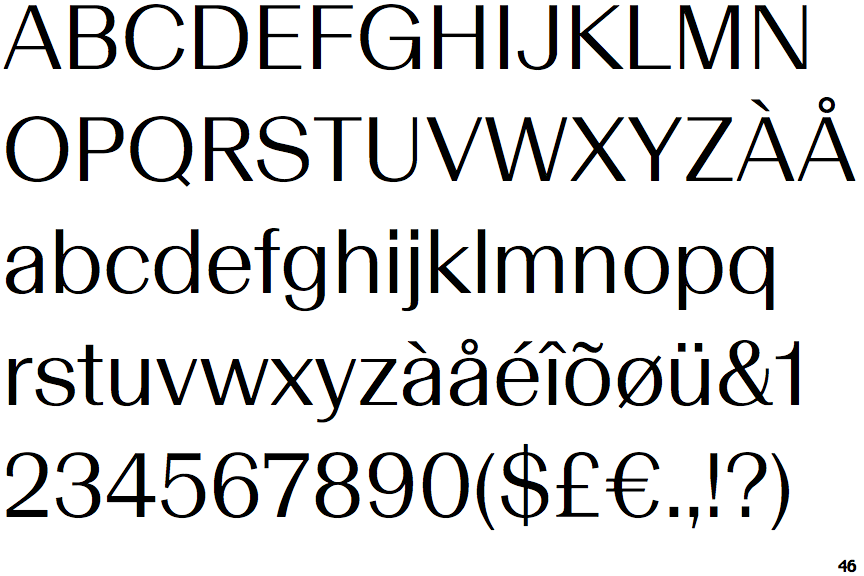
Note that the fonts in the icons shown above represent general examples, not necessarily the two fonts chosen for comparison.
Show Examples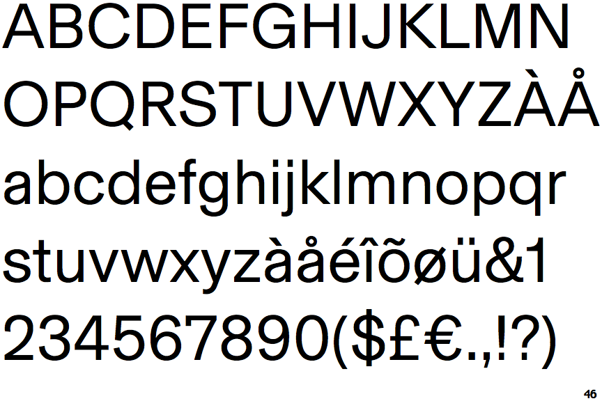
 |
The upper-case 'U' strokes are the same thickness.
|
 |
The upper-case 'M' vertical strokes are both the same thickness.
|