 |
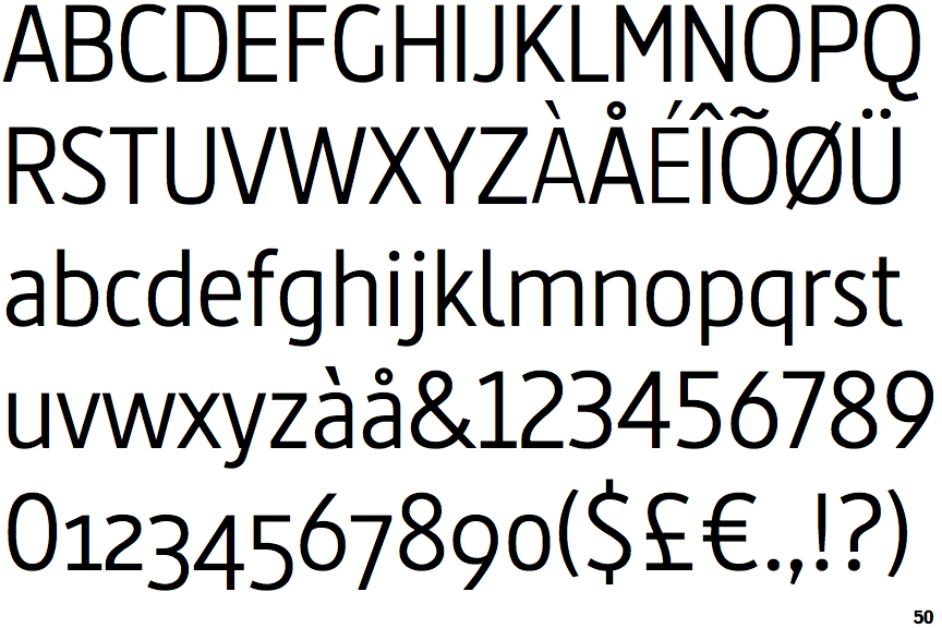
The '&' (ampersand) is traditional style with two enclosed loops.
|
 |
The '4' is closed.
|
 |
The diagonal strokes of the upper-case 'K' meet in a 'T'.
|
 |
The centre vertex of the upper-case 'M' is above the baseline.
|
 |
The verticals of the upper-case 'M' are parallel.
|
 |
The top storey of the '3' is a smooth curve.
|
 |
The upper-case 'G' has no bar.
|
 |
The dot on the lower-case 'i' or 'j' is circular or oval.
|
 |
The '1' (digit one) has double-sided base or serifs.
|
 |
The tail of the lower-case 'j' is curved with no upper serif.
|
Note that the fonts in the icons shown above represent general examples, not necessarily the two fonts chosen for comparison.
Show Examples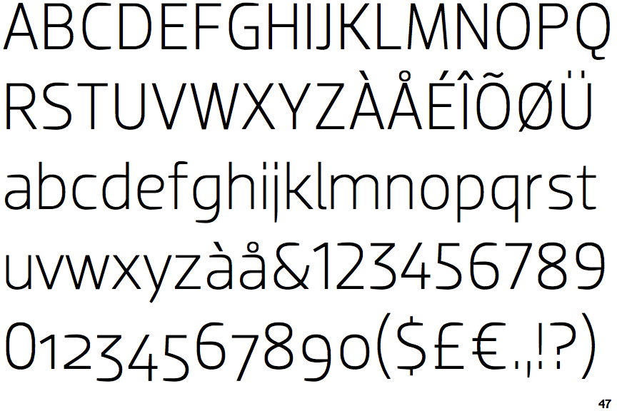
 |
The '&' (ampersand) is traditional style with a gap at the top.
|
 |
The '4' is open.
|
 |
The diagonal strokes of the upper-case 'K' connect to the vertical via a horizontal bar.
|
|
The centre vertex of the upper-case 'M' is on the baseline.
|
 |
The verticals of the upper-case 'M' are sloping.
|
 |
The top storey of the '3' is a sharp angle.
|
 |
The upper-case 'G' has a bar to the left.
|
 |
The dot on the lower-case 'i' or 'j' is square or rectangular.
|
 |
The '1' (digit one) has no base.
|
 |
The tail of the lower-case 'j' is straight with no upper serif.
|