 |
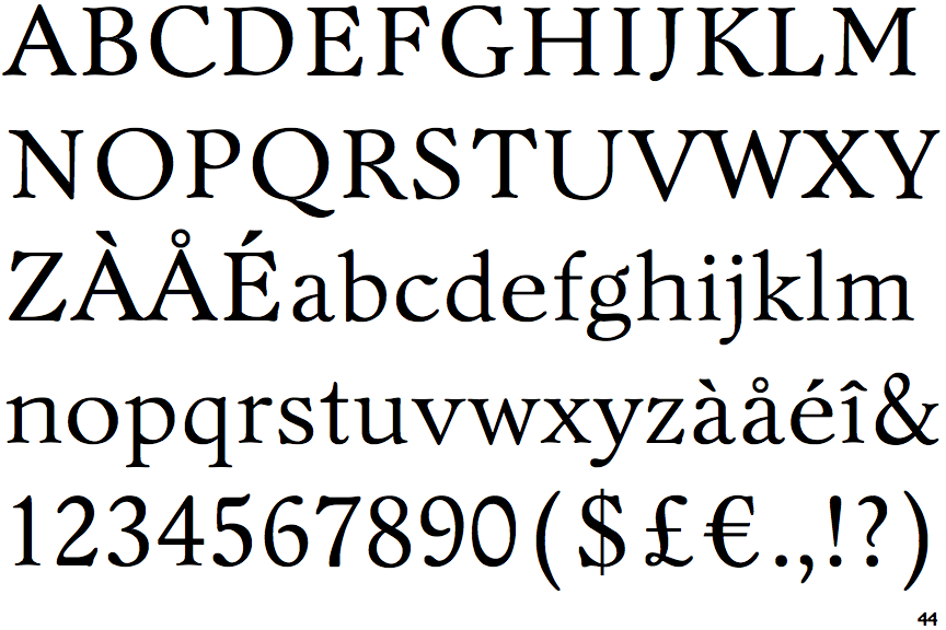
The centre vertex of the upper-case 'M' is above the baseline.
|
 |
The top of the upper-case 'A' has no serifs or cusps.
|
 |
The upper-case 'G' foot has no spur or serif.
|
 |
The top of the upper-case 'W' has three upper terminals.
|
 |
The foot of the '4' has double-sided serifs.
|
 |
The bar of the upper-case 'G' is double-sided.
|
 |
The lower storey of the lower-case 'g' has no gap.
|
 |
The '1' (digit one) has double-sided base or serifs.
|
 |
The bar of the '4' has no serifs or spur.
|
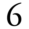 |
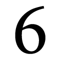
The bowl of the '6' leaves a gap with the vertical.
|
Note that the fonts in the icons shown above represent general examples, not necessarily the two fonts chosen for comparison.
Show Examples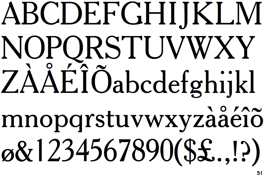
 |
The centre vertex of the upper-case 'M' is on the baseline.
|
 |
The top of the upper-case 'A' has a serif or cusp on the left.
|
 |
The upper-case 'G' foot has a forward pointing spur or serif.
|
 |
The top of the upper-case 'W' has four upper terminals.
|
 |
The foot of the '4' has no serifs.
|
 |
The bar of the upper-case 'G' is single-sided, left-facing.
|
 |
The lower storey of the lower-case 'g' has a gap.
|
 |
The '1' (digit one) has no base.
|
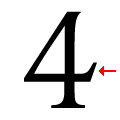 |
The bar of the '4' has a single spur.
|
 |
The bowl of the '6' meets the vertical.
|